Let's Wait a While (comments)
Displaying 21 - 40 of 40 comments

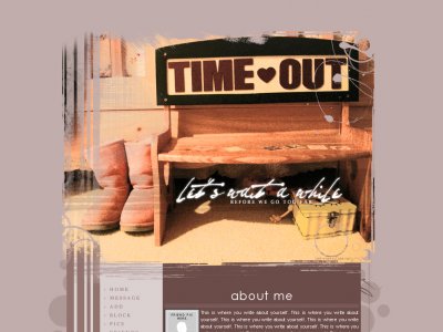
The Uggs were an awesome touch. I love the colors you used. Great job.

QUOTE(anime.essence @ Mar 5 2007, 5:41 PM) [snapback]2482758[/snapback]No it's not your fault Mark. It just happens sometimes, I just wanted you to know. Great design by the way. Hey thanks, Ricksterr. Urghh, on a sidenote (I just saw your

No it's not your fault Mark. It just happens sometimes, I just wanted you to know. Great design by the way.
QUOTE(The Markster @ Mar 5 2007, 7:01 PM) [snapback]2482554[/snapback]Thanks, guys. You're not worthy enough anymore, Master Trancie! Hahah. You know you want to comment about the emptiness of the right side of the header image.Uh oh. Is
Thanks, guys. QUOTEmark.. we already went over this. WHERE IS TRANCIE NAME NEXT TO SPONGEBOB?!!!?spongebob *droolsS*You're not worthy enough anymore, Master Trancie! Hahah. You know you want to comment about the emptiness of the right

Oh wow. Such a great layout with a very soft colour scheme. And it's centered, I would never pull of that kinda thing ever (was it tables or DIV that helped you center btw?). The subtle use in brushes with the layout image really looks great. And the
The images weren't hosted under Createblog whenever it went through the submitting process. That could result in a bandwidth issue.
mark.. we already went over this. WHERE IS TRANCIE NAME NEXT TO SPONGEBOB?!!!?spongebob *droolsS*


QUOTE(The Markster @ Mar 4 2007, 9:09 PM) [snapback]2481649[/snapback]BTW, I changed the text this time. Hopefully it looks better. yeah looks nice
QUOTE(The Markster @ Mar 4 2007, 9:09 PM) [snapback]2481649[/snapback]BTW, I changed the text this time. Hopefully it looks better. Yeah, the font for "let's wait a while" suits the layout better now. Very nice job on everything.
Thanks for all the feedback and compliments, guys. I really appreciate them.QUOTE. .and speaking of navigation this ones is amazing simple yet cool . .Haha, thanks. (Notice how I tucked my credits link in the "Blogs" image )BTW, I changed the t
yeah at first i though they were text... but tfound out they were imagesnice link effect... u should make a script

i agree with amanda pretty bad ass i love the way it's set up easy to navigate and speaking of navigation this ones is amazing simple yet cool. I really like this one
Much better then when i first saw it... was soo bare lollove it, the colors and the themeu didn't change the font, but it wasn't like it made the layout badagain another bad ass layout
QUOTEAwesome stuff; I love this. I love the brush work around the edges of the image, especially on the strips down the left side. It's very modern vintage (if such a contradiction exists) and the colours are very chilled, mid-West romantic. The heade
Awesome stuff; I love this. I love the brush work around the edges of the image, especially on the strips down the left side. It's very modern vintage (if such a contradiction exists) and the colours are very chilled, mid-West romantic. The header ima
i love this!i really liked what you did to the imageand the uggs in the layout are cuteei also love what you did with the circles next to the blog
Add Comment
You must be logged in to comment
Layout Details
| Designer |
markmejia
|
| Submitted on | Mar 4, 2007 |
| Page views | 131382 |
| Favorites | 549 |
| Comments | 40 |
| Reviewer |
themarkster
|
| Approved on | Dec 31, 1969 |