Music is life (DIV) (comments)
Displaying 21 - 35 of 35 comments

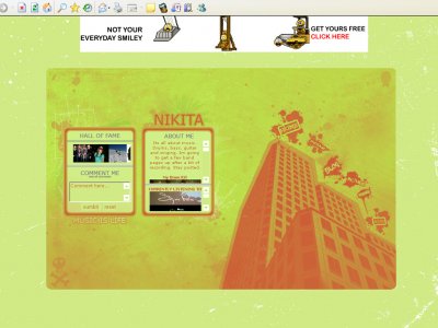
dun dun dun here's trancie critique x]- hate the color -____- i mean it's designed in a "unnoob" way but the color is "noobie" - where it says "Music is life" you could've use a better font, or different border.-
QUOTE(Intercourse. @ Feb 27 2007, 2:07 AM) [snapback]2474035[/snapback]^Nah I didn't mean the layout that is up now was an eyesore, he had a vibrant orange color as the background color instead of the blue that is up now.. Oh right, I see, so
QUOTE(flaymzofice @ Feb 27 2007, 1:06 PM) [snapback]2474034[/snapback]I don't think the colours go badly together and my first impressions wouldn't be to say the layout is sore on the eyes but I wouldn't like to look at it for too lon

^Nah I didn't mean the layout that is up now was an eyesore, he had a vibrant orange color as the background color instead of the blue that is up now..
I don't think the colours go badly together and my first impressions wouldn't be to say the layout is sore on the eyes but I wouldn't like to look at it for too long though like you said, the unusual combination does have its unique appeal.I&#
well as long as you like them, thats all that matters
thanks... but i actually think the colours work.. hmm, maybe i am colour challenged. I think it gives an unusual appeal, maybe not everyones cup of tea. But when i imagined it printed and blow up, i really like the colours together.
Well mostly I think its just the fact that its orange and green. I like how the background looks now though.
ok... i think this helps with the eye sore factor. bit of contrast and ecsentuates the design more.
i was worried about the colours... the original was all blue. but ive made too many blue layouts and i thought id try this. i might change it to the blue one if more poeple say the same thing.thanks for the feedback

QUOTEi did the outline and some shading and edging... but the building itself was a picture. i changed the prospectives as well. im glad you like it.Well, that's still really cool. I like the way you edited the picture to make it look hot on your layo
I think the colors are a bit of a eye sore, but the overall design I think it pretty neat.

i did the outline and some shading and edging... but the building itself was a picture. i changed the prospectives as well. im glad you like it.
Whoa! This is pretty neat. Did you draw that building yourself?
Add Comment
You must be logged in to comment
Layout Details
| Designer |
nikita_miltiadou@hotmail.c
|
| Submitted on | Feb 26, 2007 |
| Page views | 94625 |
| Favorites | 273 |
| Comments | 35 |
| Reviewer |
nikita_miltiadou@hotmail.c
|
| Approved on | Dec 31, 1969 |