Never Back Down (comments)
Displaying 21 - 33 of 33 comments
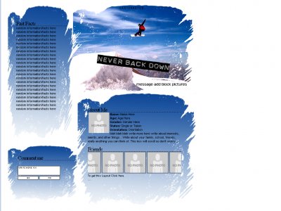
The brush work around the content boxes is awesome, loving the feel it creates, a lot; goes really well with the concept. And like fainaru said, the gradient adds a really good touch.
Your design stuff is really good, but i just thought id give you something to think about.Center your designs around your tables. Make all the boxes you want to contain stuff, then add brushes and vectors aroung this. By doing this, the user sees all the
Cool layout. i think the fun facts section is a little big though. I don't think many people would write in that much, but looks good.
the straight lines are part of the cutout i used to make them it's supposed to be there but i agree it's not the best layout considering the blending of the tables
nice layout... i like the idea. The one thing i have to comment on is that the content boxes with the bush do not seem to interlink/blend with each other. You can see the straight lines. but besides that its awsome!
thanks everyone for the feedback. The commentbox size can be changed easily but again i made it quickly for my friend so i didn't size it perfectly
QUOTE(fainaru @ Feb 17 2007, 6:07 PM) [snapback]2459950[/snapback]Ah! I can't believe I've never commented on your layouts before, but I'm a big fan of some of them - you always seem to balance positioning with design very well. L
This is a pretty neat layout. The borders for each content box are cool, and the blue fits well with all of it.
Ah! I can't believe I've never commented on your layouts before, but I'm a big fan of some of them - you always seem to balance positioning with design very well. Love the touch of the gradients in this one.
Add Comment
You must be logged in to comment


