Vanessa Hudgens (comments)
Displaying 1 - 20 of 20 comments

I like Vanessa Hudgens I am a big fan of her I want to meet her someday. and yes you should make another one.


i love Vanessa hudgens so can u please make another div overlay of her
thatnks for making this vanessa hudgens layout i love her im putting this on my page
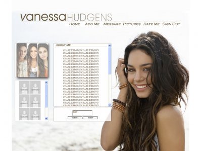
I actually think it's really good as it stands. Using brushes on it would probably complicated the very clean, 'white' theme you've got happening. It just seems really beachy and simple and it works.Post edited. Please don't speak of p
I like the professional looking set up, but you might want to enhance her picture a bit =)other wise, good job.
This is pretty good. I agree with the first response though. Perhaps you should have used a fancier font for the navigation.


i actually think this is better than your other ones but it's still very simple i would have liked to see more brushes or something but good job
It looks really good, like others have said maybe a little more here and there but good job!
love the layoutbut i still think you could maybe do some more to the main venessa image; maybe a little overlay
Thanks ^ appreciate it.I changed up the images on the left with higher quality images.

^x3 No need to say all of that. Some people really like simple layouts and you don't need to be saying that his layouts don't "compare" just because he doesn't use what most others do (brushes, textures , etc). If its not your style
I use a five year old paint program, and i have little to no brushes. I've been offered to do myspace layouts for Shady Records, so i think I do fairly well with my outdated program.

Good job. I just think some of the pictures on the left hand side are a little bad quality.

QUOTE(The Markster @ Feb 10 2007, 5:44 PM) [snapback]2451432[/snapback]The layout looks good. I'm just not fond of the font that you used fot the navbar and the About Me title.i agree, your layouts are very simple... far too simple compare to

The layout looks good. I'm just not fond of the font that you used fot the navbar and the About Me title.
Add Comment
You must be logged in to comment