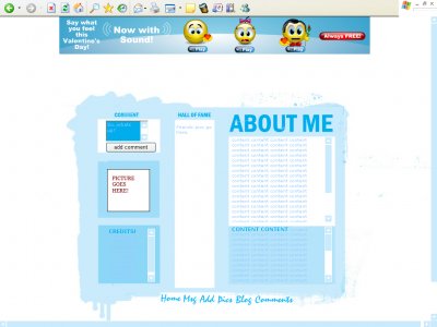
Cool in Blue (DIV) (comments)
Displaying 1 - 16 of 16 comments

how can i change the background from the plain white to a different color blue or maybe even a zebra print? i have tried all kinds of things but i cant figure it out, please help
I love it but none of my friends pics will show up =( i mean i put em on photobucket and htmled em and everything but it still wouldnt show up =(

ok... was my first layout. First time using photoshop CS2. Give me a chance and see what my future work will be.


Thanks guys... this was my first layout. so its great to here some positive feedback.

Nice...Good job...I like the jumbled paint look...Good job...
Very light and fresh; not a fan of the default font values but these are changeable obviously. Very simply and well done.

simple, but the colors fit to winter anyway like the about me font

You can change the font... edit any of these values in the about me section. This lets you change the colour, size and style of the font.CODEtextarea{ background-color: 01ADED; width: 100px; height: 50px; color: 99CCFF; font-size: 11px

I actually like it. I wouldn't use it because I like dark colors, but doesn't mean it's not nice. I think the font should be darker, though. To be able to read the text. Otherwise I think many of us would go blind ;)
Add Comment
You must be logged in to comment
Layout Details
| Designer |
nikita_miltiadou@hotmail.c

|
| Submitted on | Feb 3, 2007 |
| Page views | 109961 |
| Favorites | 286 |
| Comments | 16 |
| Reviewer |
nikita_miltiadou@hotmail.c
|
| Approved on | Jan 1, 1970 |