Love (comments)
Displaying 21 - 40 of 45 comments

ummm what is THAT will jsut get to me has A.S.A.P.Thank You for your time..

QUOTE(eNVy of mEAh @ Feb 1 2007, 10:22 PM) [snapback]2440001[/snapback]hEy...will yeah I LOVED IT!!!! will yeah YOU did a GREAT TIME ON IT!!!will umm I was wondering I have this on MYSPACE, and it won't let other
hEy...will yeah I LOVED IT!!!! will yeah YOU did a GREAT TIME ON IT!!!will umm I was wondering I have this on MYSPACE, and it won't let other peoples ADD OR MESSAGE OR COMMENT ME? why? it keep on saying that"Invalid

^add this to the coding:CODE<style type=text/css>td td embed {width:0px; height:0px;}td td embed, td td object {width:0px; height:0px;}td.text embed, td.text object {width:320px; height:240px;}td.text embed {width:320px
Is there a way for me to add music too it? I love the layout but I don't like that when I add the bands music to my page, it covers up the words "LOVE".Is there anyway I could insert the coding for a mp3 player or is there a player you can s
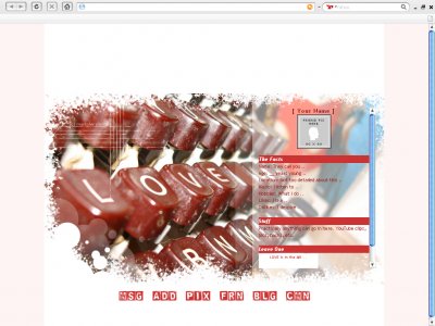
QUOTEi like the white. a dark rich red on a nice clean white looks good.QUOTEcool picture useage. niiiceThanks.

i like the white. a dark rich red on a nice clean white looks good.
QUOTE(flaymzofice @ Jan 28 2007, 8:22 PM) [snapback]2435460[/snapback]^ do it (LOL I always seem to say that to you). The pink down the sides ruin the streamlined-ness of the layout itself. Makes it blocky and puts lines in where they aren't
^ do it (LOL I always seem to say that to you). The pink down the sides ruin the streamlined-ness of the layout itself. Makes it blocky and puts lines in where they aren't needed.Oh, just checked out the layout itself again and suggest the following:F
Hmm, you think I should change it? I'm not a fan of pink myself.

weird... didn't noticed before that it was a light light red... white would of been better

Thanks for all the comments, guys. QUOTEOh this one is so rockin. I love the way the content box lays over the image; hazy and blurry and quite dreamy as a result, which obviously suits the theme really well. My only complaint is the way the title bars (t
Oh this one is so rockin. I love the way the content box lays over the image; hazy and blurry and quite dreamy as a result, which obviously suits the theme really well. My only complaint is the way the title bars (the red parts) in your content box seem t
u can tell that its edited but u did a pretty good job, and the nav links are awesomewell this whole layout is awesome, u make amazing designs
Add Comment
You must be logged in to comment
Layout Details
| Designer |
markmejia
|
| Submitted on | Jan 27, 2007 |
| Page views | 127763 |
| Favorites | 413 |
| Comments | 45 |
| Reviewer |
themarkster
|
| Approved on | Dec 31, 1969 |