Here In Your Arms (comments)
Displaying 21 - 40 of 43 comments

thanks that did help. however if you look at my pagewww.myspace.com/spoiledsnc1978if you go to the bottom on the right hand side under interests. the text is all the way to the right. and the same thing at the topwhere my picture is at. I know this is

CODE <center> text here </center> that should center it just put your content where it says text here
I really like this layout. Thanks! I tweaked mine a bit. Under my details the font is all the way to the right hand side. Is there anyway to center this? or fix the coding already in place. The same goes for the table where my picture is at.

yes how do i get back the labels and stuff. also in the about me sectin when i put stuff in bold it doesnt come up . how do i fix that??
i love this layout so much, but when i use it, it smushes all my pictures and every so that they are next to each other, how can i make it so that my pictures go back to normal
How do I get my interests/books/etc back? I have the content, just not the labels. Thanks
to get your top friends back take out this codeCODEtable table td.text table td.text table table tbody td table, span.btext {display: none !important} </style> its near the bottom
It looks like you overused the brushes in the banner. But I like the theme.
Help? Someone, i really dont know how to change it so i can view my first top 8 on my profile?
How do i make it so i can see my top friends list?What do i get rid of or add, can someone tell me?
Corine, if you wanted to use this layout and didn't want the images to have a odd color to them just get rid of this:CODEimg { filter: Gray }a:link img { filter: Gray }a:hover img { filter: Gray } img {filter: gray; border:
this one is my fav layout but however the banner of this layout didnt show up becuz i think i have the music player
i like this layout .. but when you use it .. all the image comments people send you turn funny colors .. not funny but different from the normal colors .. otherwise its really good
well if you preview it on the new myspace st it's nice and spaced out like in the screen shotClick Here Foe an Example

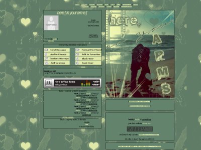
I think this is one of your better ones. I see how the background matches though, the hearts are in the banner image and such. The background color on the links makes the contact box look a little odd, but thats how it is with that.
Add Comment
You must be logged in to comment
Layout Details
| Designer |
IVIike
|
| Submitted on | Dec 23, 2006 |
| Page views | 221192 |
| Favorites | 514 |
| Comments | 43 |
| Reviewer |
moorepocket*
|
| Approved on | Dec 31, 1969 |