You Never Really Lose... (comments)
Displaying 1 - 20 of 26 comments

I love this layout, but the plain white background is boring. If the background was dark blue, or a shade of blue it would really stand out more and look more creative. Just a thought, but I still love this.

when i use this code the menu options on the top of the page come out pixelated...what went wrong? i really want to use it but i don't like the pixelated menu options...help out please!

i'm a strickly div overlay layout person, but the only standards i've liked have been by you. you've even got some great divs. very impressive, keep it up.

This is my Favorite Layout out of all the layouts on creaetblog. Great job I love it.
Make new layouts plz I love you style and quotes.
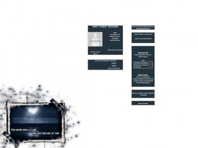
I wish this image was in a DIV. I would use it in a heartbeat!

Luv the background image.
I really do.
&& I like the layout too... nice && skinny.
^_____^
The background picture with the quote and heart isnt showing up =[

I really really love this one. I've always thought the moon over water was gorgeous...and how it's a heart is just perfect. The colors are nice, too. :)

I think the image is a little low in quiality with the splatters and such although the image inside of it looks okay.
Aww thats a really cute backround. I like seeing simple layouts back up.

^- it will actually stretch out when you fill it with content
Add Comment
You must be logged in to comment
Layout Details
| Designer |
IVIike

|
| Submitted on | Nov 19, 2006 |
| Page views | 330658 |
| Favorites | 513 |
| Comments | 26 |
| Reviewer |
StanleyThePanda
|
| Approved on | Jan 1, 1970 |