Designer's Comments
Look carefully for specific instructions
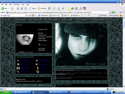
I originally made this layout for my profile on myspace. The blue tones just seemed to flow together well. Do whatever you want with contact tables and stuff! Peace Out!
Using This Layout
For specific instructions read designer's comments
- 1. Log into myspace.com
- 2. Click on Edit Profile (Profile 1.0)
- 3. Copy (ctrl c) and paste (ctrl v) code to the specified fields
Layout Comments
Showing latest 6 of 6 comments

It's cool, I like the layout photo, Vincent rules! xD
By Luni on Dec 23, 2007 9:35 pm

QUOTE(blaqheartedstar @ Oct 7 2006, 1:18 PM) [snapback]2310059[/snapback]like the colors and the bg but not the extended image... looks like u just used a filter and that was ityeah amanda i agree but its overall a pretty nice layout
By IVIike on Jan 2, 2007 8:16 pm

Really nice! =)
By MeloFool on Oct 15, 2006 5:44 pm

Nice! The colors are unique.and love the print in the back. Usually I don't like those, but this one is pretty nice. Great job!
By KissMe2408 on Oct 7, 2006 5:57 pm

like the colors and the bg but not the extended image... looks like u just used a filter and that was it
By Blaqheartedstar on Oct 7, 2006 2:18 pm
Yes! A Vincent MySpace layout! :D
By tokyo-rose on Oct 7, 2006 11:57 am
Layout Details
| Designer |
WickedQuartZ
|
| Submitted on | Oct 6, 2006 |
| Page views | 95,125 |
| Favorites | 114 |
| Comments | 6 |