The Academy Is...Green (comments)
Displaying 1 - 11 of 11 comments

I would love one with the main focus being Sisky. I love that kid!
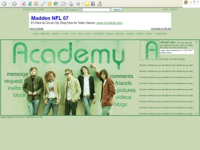
Hehe. Love it. But, might I suggest a layout with a more recent.. uh.. picture? Haha. I can swear thats either
a. pretty old
b. Tom left? (If thats tom. I don't think thats Micheal?)
c. Adam and Andy changed a ton
Thanks a bunch.

QUOTE(Rose-A-Lee @ Aug 28 2006, 1:31 AM) [snapback]2257336[/snapback] Hmm? I thought i did use a div method...? Do you really think i should have hidden them? I usually like to keep them around. Oh yes. You should have hidden them. I do

QUOTEthe textbox is supposed to show code so people know how to create the text i used for "about me"i mentioned it cuz it happens often that people's comment box messes up on them

QUOTE(Spiritual Winged Aura @ Aug 28 2006, 1:24 AM) [snapback]2257333[/snapback]Did you not want to cover the default links? You can simply use a div method.Yeah, it would had been better to remove the default links.Hmm? I thought i did use a div
Did you not want to cover the default links? You can simply use a div method.Yeah, it would had been better to remove the default links.And, you have a horizontal scrollbar in your module. Does it serve any purposes?however, Your layout is really really r
^ thanks for letting me know. i don't have firefox on my laptop yet, so i don't know if what i did helped but i put in some !important tags. the textbox is supposed to show code so people know how to create the text i used for "about me&q
maybe cuz i'm on firefox but the overflow on the bottom is really bad... i mean its insanly long... and ur text box is messed up showing some codes... and um.. the layout is a bit too long for an average 1024x768 full screen browser window
Add Comment
You must be logged in to comment