Designer's Comments
Look carefully for specific instructions
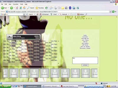
Using This Layout
For specific instructions read designer's comments
- This is a div overlay layout, html knowledge required!
- 1. Log into myspace.com
- 2. Click on Edit Profile (Profile 1.0)
- 3. Copy (ctrl c) and paste (ctrl v) code to the specified fields
Layout Comments
Showing latest 8 of 8 comments

It looks like you just googled some random wallpaper and put some transparent boxes over it.
The font is way too small, especially for those boxes (which are too big)
The navigation is small too, plus the colors don't blend.
It might be CB, but your comment box is slightly out of the navigation.
The image isn't nasty, it just has such sucky quality that it looks nasty.
Try saving your images as .png = high quality.
You should try to learn some image rollovers to replace the links with images.
It's good overall, just needs a LOT of work.

The image is huge and its hard to tell what it is. Also I don't get why the tables are so huge when theres barely anything there.. The font is ugly. And the grids are random there forth making them dumb. =(

well, i dont day that teh image is nasty. personally, i think its pretty good :] BUT i would like to say that....the quote is very depressing, yet the colors are very BRIGHT, which i say, dont really mesh..but then again, if they dont seee the quote, what does it matter? XD

QUOTE(blaqheartedstar @ Aug 15 2006, 12:46 AM) [snapback]2236121[/snapback]... the image looks nasty...agreed i can barely make out what it is

HEY!! I LOVe your layout!!!. . . . Im just starting out but Im getting an idea of how things are done pretty quickly - How can you make your friend's pictures scroll?? what bit of the code is taht? ....if you recoment any tutorials
mmmmm dude, the text is right over his head.
1. terrible link background.2. font doesnt look suitable3. the background is ... too big .. and okay quality.

... the image looks nasty...
Layout Details
| Designer |
strawberry_ramen
|
| Submitted on | Aug 14, 2006 |
| Page views | 69,736 |
| Favorites | 74 |
| Comments | 8 |