Designer's Comments
Look carefully for specific instructions
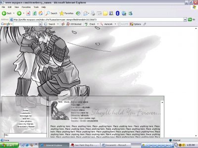
Using This Layout
For specific instructions read designer's comments
- This is a div overlay layout, html knowledge required!
- 1. Log into myspace.com
- 2. Click on Edit Profile (Profile 1.0)
- 3. Copy (ctrl c) and paste (ctrl v) code to the specified fields
Layout Comments
Showing latest 5 of 5 comments

I like the choice of imagery, but I don't like how it looks like it's chopped off. (Like what dilligrout wrote).
If you're using Photoshop, try using your eraser tool, and using a round brush set the hardness to 0% so it's fluffy and feathers the edges, and you can just easily go along that top cloud/smoke/fog/whatever and give it that foggy feeling.
As for the boxes, The about me box isn't bad, could use something else.. maybe some headers?
The navigation defiantly needs work. The links are too small and look EXACTLY like your other layout. Maybe you should try something else? Using different colors, different decorations (like underlines or strikeouts when rolled-over)
As for your comment box, it needs to be resized and re-aligned with the box, It's just smack dab in the center of the navigation and crossing over to the about me box.
(that could also be a CB thing)

theres like two backgrounds and they tile.. ick. And it's black and white.. theres no border at the top so it makes it look like its just chopped in half..

much better then your other one only one thing when you make the div areas extend them to the edge of your area in the image becuase it just cuts off and that makes it looks weirdgod job though

awww, this layout is cute!! great job!
wow. i like it. i like how you use real 3d image as background for the blog and module.
Layout Details
| Designer |
strawberry_ramen
|
| Submitted on | Aug 14, 2006 |
| Page views | 65,421 |
| Favorites | 67 |
| Comments | 5 |