Designer's Comments
Look carefully for specific instructions
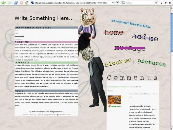
Experimenting with different styles again. This was originally going to be a Magazine Cutout Layout, but things happened.
Replace the XXXXXX's in the "Who I'd Like To Meet" section with your friend ID, replace the text with your about me, interests and other stuff. Also the header is changeable. So remember to change that.
Using This Layout
For specific instructions read designer's comments
- This is a div overlay layout, html knowledge required!
- 1. Log into myspace.com
- 2. Click on Edit Profile (Profile 1.0)
- 3. Copy (ctrl c) and paste (ctrl v) code to the specified fields
Layout Comments
Showing latest 10 of 19 comments

This is creative...but not in a good way for me personally. But at least you came up with something that was uniquely your own idea.

can anyone tell me how to change all the information in the crazy sinful sentences/about me/interests/music sections. and how to make my own headline? I have no idea how to do any of it. i properly copied and pasted the codes, so this is now my profile, but it still has all that jibberish in the sections, and 'write something here' as my headline. ha. i need help!

Very unique. Interesting design. And hooray for humans with tiger heads.

This is insanely creative. :)

Um thanks everyone, kind of. It's not supposed to look clean or realistic, but whatever.

This is kinda neat. I really like that there's a comment space; a lot of people like to cover those up with divs. Personally, I like to show off my comments.
Very interesting. I like the colors.

Oooh that's so cool. Definitely interesting with their lion heads o_o. Could have done alittle better with cutting them out, though
Also, I'm not so crazy about the roll-overs.
They're too solid and blockish.
Otherwise, I really like the layout c:

lol. i love it

this is realy awesome!
Layout Details
| Designer |
Marlons
|
| Submitted on | Oct 8, 2008 |
| Page views | 12,895 |
| Favorites | 99 |
| Comments | 19 |
| Reviewer |
manny-the-dino
|
| Approved on | Oct 8, 2008 |