Designer's Comments
Look carefully for specific instructions
1. change the "about me" to what you want your about me to be.
2. change all the "XXXXXXX" to your friend id
including the comment box
3. change the music player
if you want to change it this is where i got it
myflashfetish
and i uploaded the song at
fileden.
DONT TAKE OFF CREDIT
if you have any comments or questions please talk to me on here (CB) or on myspace
CHAD DEVIL
ENJOY and COMMENT
Layout Copyright:
East Coast Designs & Co.
Using This Layout
For specific instructions read designer's comments
- This is a div overlay layout, html knowledge required!
- 1. Log into myspace.com
- 2. Click on Edit Profile (Profile 1.0)
- 3. Copy (ctrl c) and paste (ctrl v) code to the specified fields
Layout Comments
Showing latest 10 of 10 comments

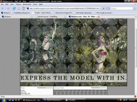
beautiful! although, i dont like the models you picked..keke, still awesome!

nice.

Within.

this is nice...i agree with brooklyneast05

This is Fantabulous ChadDevil.
I am a fan.

i love it. and i dont mind the content and picture with different widths or whatever. :D

i like this :)
Its a nice image you have on it. But I personally don't like the layout in general. I agree with them, the tables ruin the layouts quality. Don't take my response the wrong way, I'm just very honest with my opinions, I hope you take it the right way, and appreciate it. :)

I agree. The images are nice, but the content area destroys the layouts overall quality. I like your headers :D

i think it would look much better if the content area was as wide as the banner