Designer's Comments
Look carefully for specific instructions
Palette
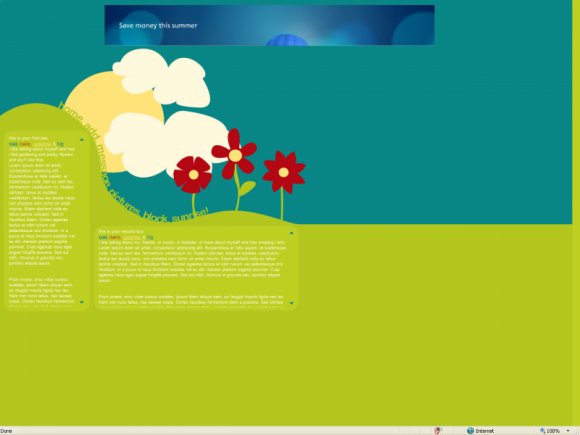
Drew everything here with the pen tool & shapes for the boxes.
The links are image maps because I didn't know what to do with them for rollovers and really wanted to get this coded up and out of the way.
If this doesn't match up properly in some resolutions, tell me: my resolution SUCKS. It's not even 4:3.
LIKE THIS?
WEBSITE | MYSPACE
Using This Layout
For specific instructions read designer's comments
- This is a div overlay layout, html knowledge required!
- 1. Log into myspace.com
- 2. Click on Edit Profile (Profile 1.0)
- 3. Copy (ctrl c) and paste (ctrl v) code to the specified fields
Layout Comments
Showing latest 10 of 14 comments

HOW COOLIO IS THAT!
LOVE THE NAVI
=] MUCHO DELICIOUS!

• This is beautiful.
• I kind of wish there were rollovers :-/
• The white text is hard to read against the bright green.
• This was very creative. I love the contrast of the red flowers and the blue sky. That's just ... beautiful :P

This is cute, although I agree with the links. I think there should have been more contrast in color, some rollovers would be nice too :)

simple and nice
a bit more contrast with the green and the text would've been nicer
it's a bit hard to read since the font is small

This is very inspiring. I was looking for ideas, and now I have received some. If I make a layout using you as an inspiration, I'll be sure to mention you. ^^

very nice. i just wish the sun had more definition. but still awesome.

nicely done.

very simple and creative! love the colors! great job!

I LIKE!

Very cute, I love the text placement. :]