Designer's Comments
Look carefully for specific instructions
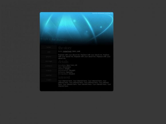
I'm actually really proud of this layout. I loved the way it came out, and it took me quite a while until I was content with its appearance. I hope you all enjoy it as well.
THE NAVBAR AND PROFILE ARE HIDDEN, just not in the preview on here.
Don't forget to replace the XXXXXXX with your friendID.
RULES
1. Please do not steal this code/layout. Honestly, if you can't make one, ask for help, instead of passing off work as your own. CB has great tutorials to get you started on making your own DIV layout.
2. Please do not remove the credit, seriously. Just don't.
SIDE NOTE
This layout does require previous knowledge of both HTML and CSS. Please do not use this layout if you have no clue at all of what to do. I can try and help you but, I'm rarely online/answer messages. CB has a great selection of standard layouts as well which are easier to use.
CREDITS
Every thing was coded and created by me, special thanks goes to RockitStudios for their hide the myspace profile and new navigation bar script.
Using This Layout
For specific instructions read designer's comments
- This is a div overlay layout, html knowledge required!
- 1. Log into myspace.com
- 2. Click on Edit Profile (Profile 1.0)
- 3. Copy (ctrl c) and paste (ctrl v) code to the specified fields
Layout Comments
Showing latest 10 of 17 comments

I love the black on blue effect. I think it goes quite well. :)
I adore the image. It's very original and i like the way you have the text at a slant. It gives off an air of uniqueness. Kudos to you ^_^

The preview looks a bit odd but it caught my attention.

Sweeeeeeeeeeeeeeet.

Question.
The player is sticking out awkwardly.
Any fix for that?
I'm using Safari on OS X.

This is really nice. I like the navigation.
I think it might look better if it were a little bigger? -shrug-
Thanks buddy! This is a great layout. I will use this up until I get the time and the unlaziness to create my own. :P
Once again, very nicely done.

Awesome. :D

love it

Spiffy ^-^

This is so pretty! Ièd love to see the blue graphic as a wallpaper too haha.
Layout Details
| Designer |
melancholiclights
|
| Submitted on | Aug 23, 2008 |
| Page views | 18,141 |
| Favorites | 127 |
| Comments | 17 |
| Reviewer |
manny-the-dino
|
| Approved on | Aug 23, 2008 |