Designer's Comments
Look carefully for specific instructions
Leave the credit.
**LINKS FIXED**
Using This Layout
For specific instructions read designer's comments
- This is a div overlay layout, html knowledge required!
- 1. Log into myspace.com
- 2. Click on Edit Profile (Profile 1.0)
- 3. Copy (ctrl c) and paste (ctrl v) code to the specified fields
Layout Comments
Showing latest 10 of 10 comments

yeah could you please fix the x's i would love to use this layout!

love the layout...but the view pictures and send message buttons dont work. Where are the rest of the X's besides the comment?

hey i cant find the X's to replace with my friend id...I saw them for the comment box only...please help..
p.s love the layout
i want this layout so bad how do i get it to show up on mi myspace page tho i dnt get it

where can place my friend id on the code, i cant seem to find it. i need help..

i really liked this layout.its so simple it, yet so detailed it's amazing.
love it

Thanks for the advice, I'll move the nav links up

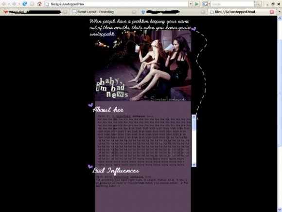
the blog area for me is a bit misaligned but its nothing that one can't adjust themselves. i love the concept of this layout. at first, i also thought the headings were misaligned too but then i realized it was suppose to be like that, so it looks okay there.

i agree with Synesthesia and i don't really like the scroll bar on the outside of the content area but thats just me. nice :]
I really like this idea. The banner is good. The only thing that could be improved is the navigation, which seems too plain compared to the rest of the layout, and I don't like how it's positioned all the way at the bottom. I thought there was no navigation at first, lol.
Layout Details
| Designer |
ScriptedLove
|
| Submitted on | Apr 17, 2008 |
| Page views | 20,509 |
| Favorites | 160 |
| Comments | 10 |
| Reviewer |
pandora
|
| Approved on | Apr 17, 2008 |