Designer's Comments
Look carefully for specific instructions
*Disclaimer: this layout was not intended for dial-up users. The reason being that I saved it as a PNG which is a larger file size than JPG, for quality reasons. Please do not complain about load time--I hate it, as well, but I'd rather upload higher quality graphics.
Also, this layout is only a bit complicated. It's not simply a copy and paste layout.
If you need help, feel free to message me. That's why I'm here.
Instructions:
Ctrl+F all "XXXXXX" and replace that value with your friendID.
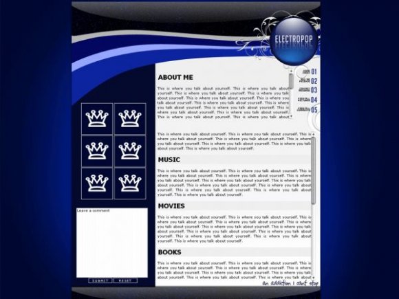
On the side module, I have put six empty slots for you to insert your own friends' pictures. They must be 100x100px, avatar size. Just replace my IMG links with yours and so forth.
If you want music, Ctrl+F "embed, object" and remove that code. I don't code my layouts with music in mind, so I hope it shows up where you want it to, or you know how to position it.
Everything was done by me, except the floral design I used was by ro-stock on DeviantART. She/he has a very useful stock.
Using This Layout
For specific instructions read designer's comments
- This is a div overlay layout, html knowledge required!
- 1. Log into myspace.com
- 2. Click on Edit Profile (Profile 1.0)
- 3. Copy (ctrl c) and paste (ctrl v) code to the specified fields
Layout Comments
Showing latest 10 of 33 comments

this is a real good layout but it hides the myspace add on top an i dont wanna get deleted

awesome job here! love it!

This is an awesome layout. Good work. :)

This is a great layout =)
The colors are just stellar.
Everything works out perfectly.
But the thing Im not very fond of is the reflection on the bottom.
It seems like too much.

I don't really think "electropop" is a good name for it, I was expecting bright, poppy colours, but that's just how my mind works, it's gorgeous.

Your Layouts are great, i dont like minimal layouts :S


i love hows there so much space. and the blue is awesome. :D!

Charliezac: Thank you for being one of the most sensible people that has commented.

the problem with most createblogs profile submissions, is that they look like 12 year olds do them. not a lot of people want a narrow div with a huge pic of daniel radcliffe, and very little room for personalization. thats why i like yours. keep up the good work
Layout Details
| Designer |
MissHygienic
|
| Submitted on | Feb 26, 2008 |
| Page views | 20,785 |
| Favorites | 111 |
| Comments | 33 |
| Reviewer |
mlothepimp
|
| Approved on | Feb 26, 2008 |