Designer's Comments
Look carefully for specific instructions
Technical
1. Replace XXXXXXXXX with your friendID.
2. Please do not use this layout if you have no previous knowledge of html or css since it's required.
3. You may remove the copyright but, it could lead to deletion of your myspace.
4. Layout was tested in both Fire Fox and Internet Explorer.
Copyright
1. Do not under any circumstances use or take my code and layout design.
2. I'm tired of searching around createblog and seeing bits and pieces of my code in other people's layouts.
3. STOP STEALING!
4. Please do not remove the credit.
- Thank you for using my layout.
envisionartist
Using This Layout
For specific instructions read designer's comments
- This is a div overlay layout, html knowledge required!
- 1. Log into myspace.com
- 2. Click on Edit Profile (Profile 1.0)
- 3. Copy (ctrl c) and paste (ctrl v) code to the specified fields
Layout Comments
Showing latest 10 of 15 comments

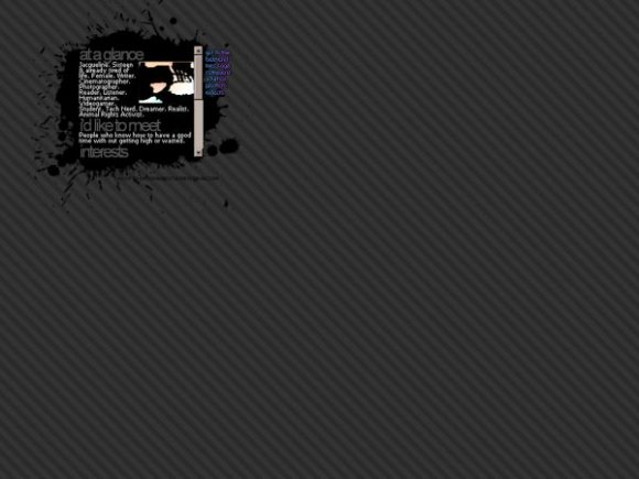
Wow, this is EXTREMELY tiny. It's cute- so cute- but people have got to be able to "see" what is there oO. I can see (barely) but most people won't able to without straining.
I love this! Love all the tiny layouts but I'm too blind to use them myself!
I like this very much, but the nav is a little tricky to read.
I love how tiny this is!
Im always a big sucker for anything small.
And the navigation has a great effect.
It really brings out the picture...adds some color =)
seriously what is it with people on here, most layouts look great even without rollovers :)
i like this alot,
i like how its small and simple :)
I see you're back and better than ever, huh? I love the effect on the navigation in comparison to the rest of the layout. Very nice work. I like your minimalist style.
Nice job. Very nice. Do you think you could maybe make a background that's the two navigation colors? I think the gray is nice, but it'd look so much nicer. x] You don't have to, but I was just asking. And guys, if you see it's too small on the tiny preview on the page, then dont even bother looking at the big one. (:
I absolutely love how it's so small. And I have a thing for paint splatters and stripes, so I really love this.
It's a good layout, but the navigation could be better.
I think it looks fine without rollovers. Nice job. :)
Layout Details
| Designer |
melancholiclights
|
| Submitted on | Feb 23, 2008 |
| Page views | 26,604 |
| Favorites | 101 |
| Comments | 15 |
| Reviewer |
miyashu
|
| Approved on | Feb 23, 2008 |


