Designer's Comments
Look carefully for specific instructions
note me (or leave a comment), if you use it!
[ best view with Mozilla Firefox]
[ best view with Mozilla Firefox]
Layout Comments
Showing latest 7 of 7 comments

Lovely.
By TheExoticPeachFairy on Aug 12, 2008 9:34 am

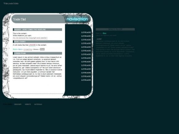
you should make the space filler section bigger, and put it in an image similar to the other one.
By heyo-captain-jack on Feb 4, 2008 11:03 pm

if i had a website i would use this. you certaintly have awesome ideas :]
By miyashu on Feb 3, 2008 10:04 pm

Very nice! I just don't like the bluish glow for "Navigation" because that doesn't match the rest of the layout's colors.
By tokyo-rose on Feb 3, 2008 9:39 pm

I like this. I really like the organization and simplicity of the whole thing. I just find that the text for the word "navigation" looks really out of place.
By markmejia on Feb 3, 2008 3:37 pm

that look very very nice!
By Melie on Feb 3, 2008 2:38 pm

I would use it if it didn't have flowers.
By NICKAWHAT on Feb 3, 2008 2:31 pm
Layout Details
| Designer |
ZeBiii
|
| Submitted on | Feb 3, 2008 |
| Page views | 9,661 |
| Favorites | 61 |
| Comments | 7 |
| Reviewer |
MissHygienic
|
| Approved on | Feb 3, 2008 |