Designer's Comments
Look carefully for specific instructions
Enjoy =]
Using This Layout
For specific instructions read designer's comments
- This is a div overlay layout, html knowledge required!
- 1. Log into myspace.com
- 2. Click on Edit Profile (Profile 1.0)
- 3. Copy (ctrl c) and paste (ctrl v) code to the specified fields
Layout Comments
Showing latest 8 of 8 comments

I love this one
By errfugly on Nov 7, 2007 4:25 am
I love this one
By errfugly on Nov 7, 2007 4:25 am

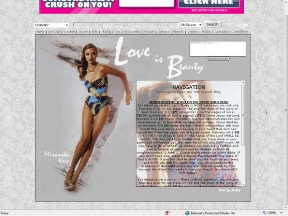
i think u should hav a main focal point. it seems dull. make the person stand out more.
By twodreamlovers on Nov 2, 2007 2:14 am

I think the comment box is randomly placed, and the background image for the text box is distracting. I also don't like the font used in the image, or the fact her name is by her legs.
I like the colors, though.
By silentSCREAMS on Nov 1, 2007 4:41 pm

i agree with brooklyneast05 about the shadow, but i think everything else about the lyt is awesome.
By jesusisthebestthing on Nov 1, 2007 12:15 am

i don't like the shadow dirty looking shit behind her.
eh, it's ok, to plain
By brooklyneast05 on Oct 31, 2007 10:59 pm

nice.
By alecreations on Oct 31, 2007 10:27 pm

the image is really nice, and i like the colors
By IVIike on Oct 31, 2007 12:34 pm
Layout Details
| Designer |
bobbyrocks15

|
| Submitted on | Oct 31, 2007 |
| Page views | 10,250 |
| Favorites | 26 |
| Comments | 8 |
| Reviewer |
IVIike
|
| Approved on | Oct 31, 2007 |