Designer's Comments
Look carefully for specific instructions
Look for instructions in code
Do not edit code in About Me
Enjoy
Using This Layout
For specific instructions read designer's comments
- This is a div overlay layout, html knowledge required!
- 1. Log into myspace.com
- 2. Click on Edit Profile (Profile 1.0)
- 3. Copy (ctrl c) and paste (ctrl v) code to the specified fields
Layout Comments
Showing latest 10 of 10 comments

cute

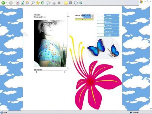
psh. i think it looks great with the flower, clouds and butterflies.
it's totally spontaneous
maybe sticking to like one picture would have been best but i really like the idea (:
x
It doesnt accept my friend id...help!

Its very colourful and I like it. BUT the pink flower looks awkward

i would've liked it more if you just chose one of the images and stuck with it, either the flower or the butterfly or clouds

i agree the background does look out of place, and sinfullysweet is right saving them in PNG avoids bad quality in images.
and the layouts setup is a bit out there, doesn't seem to be neat at all since u got clouds for a background in the page, comment box and navigation.

i agree with sinfully, the idea is good, the execution isn't

I honestly don't think the background matches.

Wow! I really like this idea, but to be honest, I dont think you implemented it well. The pictures are pretty bad quality, try saving them as psd's, then saving the final one as a png, gif, or jpg. Also, I'm not to crazy about the set up. The comment box looks really randomly placed, while (I think in the screen shot), the about me develops a scollbar, which leaves alot of blank white area.
Layout Details
| Designer |
xxjess-91xx
|
| Submitted on | Jul 30, 2007 |
| Page views | 38,416 |
| Favorites | 140 |
| Comments | 10 |
| Reviewer |
karmakiller
|
| Approved on | Jul 31, 2007 |