Using This Layout
For specific instructions read designer's comments
- 1. Log into myspace.com
- 2. Click on Edit Profile (Profile 1.0)
- 3. Copy (ctrl c) and paste (ctrl v) code to the specified fields
Layout Comments
Showing latest 6 of 6 comments

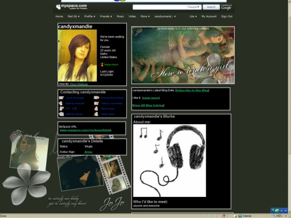
i like the layout, but i disagree guccci, i dont like the stars around each, i guess u call them sections, of the page, i.e. the banner and contact table
By jesusisthebestthing on Jul 23, 2007 2:10 am

i thought the banner had a little too much, but it's still amazing
By ThatMcFLYGirl on Jul 21, 2007 3:51 am

This is nice, I love the banner, but the colors dont seem to match..
By TaintedSakura on Jul 19, 2007 6:10 pm

ahahah I know you. hi Mandie, cute layout. this is Kirsty from pfp :)
By falsetigerlimbs on Jul 19, 2007 5:56 pm

I like this layout, just the ext. network banner is bigger than the other tables. Is there a way to align the other tables to match up with the banner?
By luku on Jul 19, 2007 4:15 pm

i like the effect on the banner
By guccci on Jul 19, 2007 2:44 pm
Layout Details
| Designer |
candyxmandie
|
| Submitted on | Jul 19, 2007 |
| Page views | 19,036 |
| Favorites | 25 |
| Comments | 6 |
| Reviewer |
mzkandi
|
| Approved on | Jul 19, 2007 |