Designer's Comments
Look carefully for specific instructions
Better than the last one...
I think so, anyway. I don't know why I did the last Constantine one the way I did... it did look a bit bland, but I wanted to do something with the picture(s), and... yeah, that's what came up.
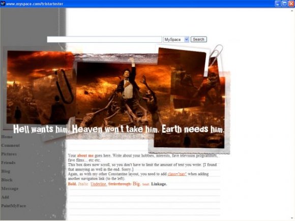
But hopefully this one's better. Plus, I love the bit where he goes into hell, and especially the like middle image on this layout I love.
Anyway.
Same applies, replace the !!!!FRIENDIDHERE!!!! with your Friend ID, and remove my writing and add your own.
If you want to add another navigational link, set up a link in the usual way but before closing it off, add class="nav" and then close it off.
I think so, anyway. I don't know why I did the last Constantine one the way I did... it did look a bit bland, but I wanted to do something with the picture(s), and... yeah, that's what came up.
But hopefully this one's better. Plus, I love the bit where he goes into hell, and especially the like middle image on this layout I love.
Anyway.
Same applies, replace the !!!!FRIENDIDHERE!!!! with your Friend ID, and remove my writing and add your own.
If you want to add another navigational link, set up a link in the usual way but before closing it off, add class="nav" and then close it off.
Using This Layout
For specific instructions read designer's comments
- This is a div overlay layout, html knowledge required!
- 1. Log into myspace.com
- 2. Click on Edit Profile (Profile 1.0)
- 3. Copy (ctrl c) and paste (ctrl v) code to the specified fields
Layout Comments
Showing latest 6 of 6 comments

Ah you're right, this one's more jazzed up. It's nice, the grunge effect goes well with the movie screens.
By umbreon on Jul 31, 2007 4:38 am

Its a step up, but there is still room for improvement.
By luku on Jul 18, 2007 1:54 am

gorgeous.
i love the quote, though it is somewhat hard to read.
By guccci on Jul 18, 2007 12:31 am

alot better than your first one but i agree that the quotes a tad hard to read
By Blaqheartedstar on Jul 17, 2007 11:38 pm

this is much better than the other one.
By riotstar on Jul 17, 2007 10:29 pm

Hmmm, A little too crowded, and you cant really see the "earth needs him" part, but.. pretty good over all. (oh yeah, the text dosnt reflect the layout in my opoinion(did I spell that right??))
By stormbringer on Jul 17, 2007 9:26 pm
Layout Details
| Designer |
PaintMyFace
|
| Submitted on | Jul 17, 2007 |
| Page views | 10,451 |
| Favorites | 17 |
| Comments | 6 |
| Reviewer |
mzkandi
|
| Approved on | Jul 17, 2007 |