Designer's Comments
Look carefully for specific instructions
Using This Layout
For specific instructions read designer's comments
- This is a div overlay layout, html knowledge required!
- 1. Log into myspace.com
- 2. Click on Edit Profile (Profile 1.0)
- 3. Copy (ctrl c) and paste (ctrl v) code to the specified fields
Layout Comments
Showing latest 10 of 11 comments

gay. it needs to be darker, different colors, and the big box is unnessacary
aww i miss them =[

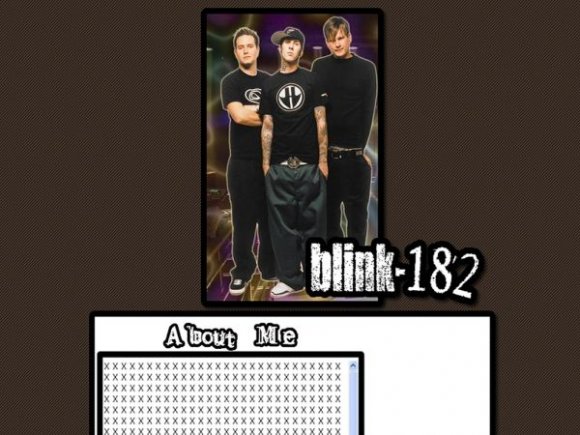
its a bit of an odd shape ... good band though.

Its pretty plain. I think the image would have looked alot better if you hadn't made that effect. And I agree with alvin, that big white spot above the navigation is troublesome =/

The large white box is annoying.

I think the "banner" would have been better on the side instead of the top since it is so slim.

The image is cool but then it's like BAM a big white box... so un-creative... :(

i agree with SChizo below,
and the thing now is doing band layouts, thats cool

More could have been done..

The layout's nice. But I don't like the purple-ish orange effect of the image, the one behind the band.
Layout Details
| Designer |
yesnt
|
| Submitted on | Jul 12, 2007 |
| Page views | 13,270 |
| Favorites | 28 |
| Comments | 11 |
| Reviewer |
moorepocket
|
| Approved on | Jul 13, 2007 |