Designer's Comments
Look carefully for specific instructions
PM for help.
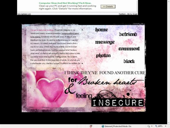
I KNOW that this layout is so horrifically girly (no offense girls) but I just HAD to make it. The lyrics are from Green Day's Restless Heart Syndrome which is one of my favourites and when I found that image I'd decided to make it. It came out slightly more pink than I'd originally envisioned but oh well. Sorry guys, there'll be one for you next.
Credits:
Image - Sortvind.deviantart.com
Texture - cloaks.deviantart.com
Brushes - missm.paperlilies.com
Please, the credit on my layout is tiny and almost unrecognisable unless you deliberetly spend hours pouring over it to find it and erase it. LEAVE IT ALONE! I emplore you, if you fail to do so I shall get my death eaters to come and kill you and your family. You have been warned. >:]
Using This Layout
For specific instructions read designer's comments
- This is a div overlay layout, html knowledge required!
- 1. Log into myspace.com
- 2. Click on Edit Profile (Profile 1.0)
- 3. Copy (ctrl c) and paste (ctrl v) code to the specified fields
Layout Comments
Showing latest 10 of 13 comments

What makes me love this is that Impact Labeler font used for the word 'Insecure'. That makes the layout. That's my favorite font. So much fun.It looks so clear in your layout...unusually clear. But....I keep repeating myself with every post and nobody's talking about how they get that 'effect'. The rollovers in this are wonderful. The pink and black look good together in here and the rollovers are divine in this. This is an A level layout for me.
This is very good.

but i lovvvvvvvvvve it
the wording at the bottom should be closer.
still gorgeous though.
the font for Broken Heart doesnt seem right

I need help Im a beginner in making layouts. I have this idea for a div overlay layout and I don't even know where to begin

It looks nice
But there are too many different fonts D:

Sexy Sexy! 21st Century breakdown :]]
i love the gradient to this and the colors wat i wish was different is the white square wasn't just stuck in the middle around the black background like that. if maybe the white part had a little border or something to finish off then i think it would really just make things pop. you know how i am im not trying to "dis" your layouts cuz your amazing like everyone else is and i just wish i can make something like this. plus for some damn reason i always got something to say. ha. good or bad.

nooooice

Love it!