Designer's Comments
Look carefully for specific instructions
In the "about me" code, you don't need to do anything to it! All it is, is codes to make all of the word, links, and headings look correctly. And to put the boxes in the correct spot!
In the "I'd like to meet" code, YOU DO NEED TO CHANGE THINGS!! like at the very end, their are links. You need to change XXXXXXXXXXX to your FRIEND ID! Don't know what a friend id is? OR where to find it? Go to your myspace and in the URL, you will find this.

Copy that outlined number, your's will be different, and paste it where the X's are!
ENJOY!
THANKS ENVISIONARTIST FOR THE CODE TO GET STARTED!
calebboyles invites you to SocialVibe.com
Using This Layout
For specific instructions read designer's comments
- This is a div overlay layout, html knowledge required!
- 1. Log into myspace.com
- 2. Click on Edit Profile (Profile 1.0)
- 3. Copy (ctrl c) and paste (ctrl v) code to the specified fields
Layout Comments
Showing latest 10 of 10 comments

You overused the spatter brushes and the way you positioned the content box is just bad. I think you could do better.

http://myspaceoverlay.net/over lay/viewimage/3218

i love this band and the graphic, but the content section and links are kind of awkwardly placed
I agree with all the text and the scrollbar is kind of offputting. Also i think the nav is abit random, if you get me. I like the banner but I think the content would be better placed somewhere else.

I kinda think if the text was easier to read,maybe if you'd used colours for bold & italic,etc.
Apart from that,it's nice. (:

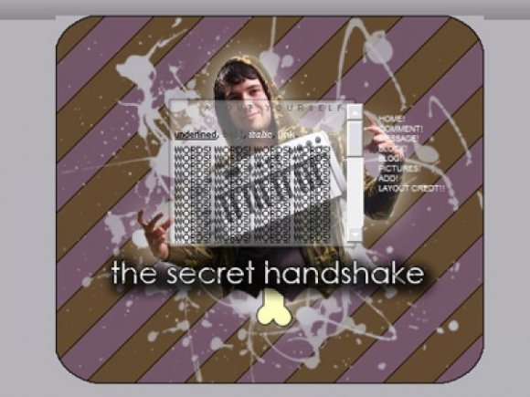
secret handshake!

this is really cool. the bone is very random, lmao.

that bone thing is kinda weird. but everything else, i like[:
&in ff its kinda mis aligned in the preview.
but, i like the whole image &the work done on it[:

Love the secret handshake ^-^ the image is cute, but the text a bit hard to read. Also, I agree with schizo lol. Cute though ^-^
-DH

The fact that he looks like a turkey leg with that bone sticking out of his is kinda weird, but the colors are nice. :D
Layout Details
| Designer |
xXcalebboylesXx
|
| Submitted on | Aug 16, 2008 |
| Page views | 5,443 |
| Favorites | 15 |
| Comments | 10 |
| Reviewer |
schizo
|
| Approved on | Aug 16, 2008 |