Designer's Comments
Look carefully for specific instructions
Layout Comments
Showing latest 10 of 10 comments

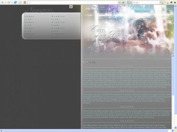
Wow I love FF13. I love the banner but I don't Like the Fact that the Body is a Scroll bar and it is directly next to the webpage scroll bar (woul've been better if it was align to the left) the navigation isnt in centered to the navigation background. but overall I do love the colors you used and picture

nice!

pretty nice layout but it messes up on higher resolutions, mines is 1200x800

Hmm it's misaligned for me in both FF and IE... resolution 1280 x 800. From the preview image, it looks great though. ^^

the navigation is misaligned, but REALLY NICE COLORS!

The colors make my eyes happy.

I think this is a good start but, in my opinion, there could be a little more with the coding. Perhaps a content area below the navigation like Synesthesia suggested. Otherwise this is an awesome layout!

Either it doesn't work well in FireFox, or it isn't compatible with all screen resolutions. If it's with screen resolutions, you may be able to fix it with margin-left's and stuff. But other than that, it is so lovely! :]

this is so pretty.
in ie, i think the navigation div box is a little too low. unless thats just my computer..
I think there should be a content area below the navigation. The left side looks too empty without one. Pretty banner, though!