Designer's Comments
Look carefully for specific instructions
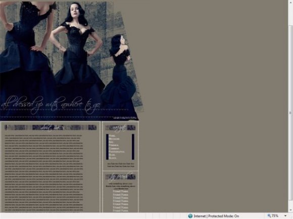
i created the overall image, and blended the three images so please credit back if you use it.
replace YOURFRIENDIDHERE with your friend id.
and THEIRFRIENDIDHERE with your friends friend id.
dont change any of the code in either section, remove no break tags or the boxes may appear "funny".
tested in all versions of IE and firefox.
best viewed in IE.
slight misalignment in firefox. this is easily fixed if you have the skills.
Using This Layout
For specific instructions read designer's comments
- This is a div overlay layout, html knowledge required!
- 1. Log into myspace.com
- 2. Click on Edit Profile (Profile 1.0)
- 3. Copy (ctrl c) and paste (ctrl v) code to the specified fields
Layout Comments
Showing latest 10 of 11 comments

Ah! Is that Dita Von Teese?
This is amazing! :D

wow, that`s elegant.

I don't like the font in the content area.
But, I love the image and colour; very beautiful. =]

I love the classic elegant look of it.
And Dita Von Teese looks great.

lovely =]

i like how the nav pops up on the other side when you scroll over. that's all i really care for about it.
Not a fan of Scriptina (I never am), but I like the color of her dress. I'd make the header text bigger.

that looks a bit painful. XD isnt that marilyn mansons wife?

This is very nice. The colors look nice, but there's a horizontal scrollbar in FF, but other than that, the layout looks awesome.

You could of blended the banner a little better, also add a little more to it instead of plan text. Other than that, fabulous job!
Layout Details
| Designer |
vintage-toile
|
| Submitted on | Mar 14, 2008 |
| Page views | 13,711 |
| Favorites | 81 |
| Comments | 11 |
| Reviewer |
Insurmountable
|
| Approved on | Mar 14, 2008 |