Designer's Comments
Look carefully for specific instructions
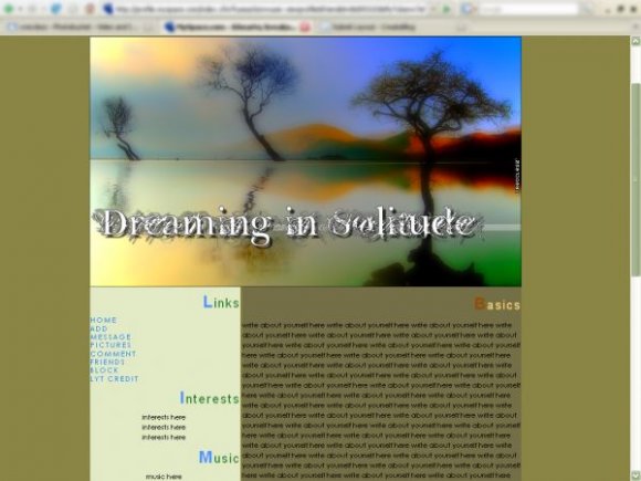
a spinoff of my personal solitude lyt on my myspace XD :
http://i90.photobucket.com/albums/k280/xrecclesz/3037e6d6.png
picture credits:
http://www.flickr.com/photos/adrian_valentin_murphy/381671928/
http://www.flickr.com/photos/adrian_valentin_murphy/440919412/
Blend by Me (:
**replace all the xxxxxx's with your friend ID .
http://i90.photobucket.com/albums/k280/xrecclesz/3037e6d6.png
picture credits:
http://www.flickr.com/photos/adrian_valentin_murphy/381671928/
http://www.flickr.com/photos/adrian_valentin_murphy/440919412/
Blend by Me (:
**replace all the xxxxxx's with your friend ID .
Using This Layout
For specific instructions read designer's comments
- This is a div overlay layout, html knowledge required!
- 1. Log into myspace.com
- 2. Click on Edit Profile (Profile 1.0)
- 3. Copy (ctrl c) and paste (ctrl v) code to the specified fields
Layout Comments
Showing latest 4 of 4 comments

hey can you do the same thing just make the comments show on the right side of the layout under the comment box
By jose09 on Feb 5, 2008 7:30 pm
I agree, the background colors dont match the image. But i like that. It gives it more contrast. If the background colors matched the image, the image wouldnt stand out.
By bsbulisticcc on Jan 27, 2008 9:13 pm
I really like the colors in the photo!
-Colors Reflected-
By Sw33tT3mptation on Jan 23, 2008 11:35 pm
this layout is similar to miyashu's...like how the first letter is different color. it's structured nicely. i like the image. i don't like the font. the background colors you chose don't match with the image.
By twodreamlovers on Jan 22, 2008 11:18 am
Layout Details
| Designer |
xRecclesz
|
| Submitted on | Jan 21, 2008 |
| Page views | 17,234 |
| Favorites | 113 |
| Comments | 4 |
| Reviewer |
Relentless
|
| Approved on | Jan 22, 2008 |


