Designer's Comments
Look carefully for specific instructions
http://autumnsunsets.webs.com
Layout Comments
Showing latest 3 of 3 comments

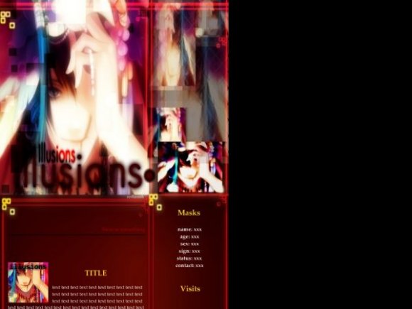
The image is like.. stretched.
I dont think the color of the layout matches the picture.
but i like it cus the guy looks hot XD
By PiNK-RAGe on Dec 27, 2007 12:27 am

This is pretty awesome, I may use it for the web page I'm making.
By heyo-captain-jack on Dec 22, 2007 6:19 am

I'm not a fan of the blurred text and images, but a nice concept.
By S-Majere on Dec 20, 2007 7:22 pm
Layout Details
| Designer |
res8zenith
|
| Submitted on | Dec 20, 2007 |
| Page views | 4,911 |
| Favorites | 17 |
| Comments | 3 |
| Reviewer |
digitalfragrance
|
| Approved on | Dec 20, 2007 |