Designer's Comments
Look carefully for specific instructions
so go to: http://www.myspace.com/ridicullo
it would be great, i'll make heaps more layouts if people add me etc.
replace all X's and !'s with friend ID
do all of this before you save all changes becasue for some reason if you do click save all changes before you do it it will change all the links :S
thanks to:
http://www.atomicaffliction.com/
and
http://www.photobucket.com/
Using This Layout
For specific instructions read designer's comments
- This is a div overlay layout, html knowledge required!
- 1. Log into myspace.com
- 2. Click on Edit Profile (Profile 1.0)
- 3. Copy (ctrl c) and paste (ctrl v) code to the specified fields
Layout Comments
Showing latest 10 of 18 comments

heyyy i need help putting this profile on my myspace.
=D
pleasse
okay so the problem is i can't find where to put my friend id for my pictures or blog

ooo i like this!

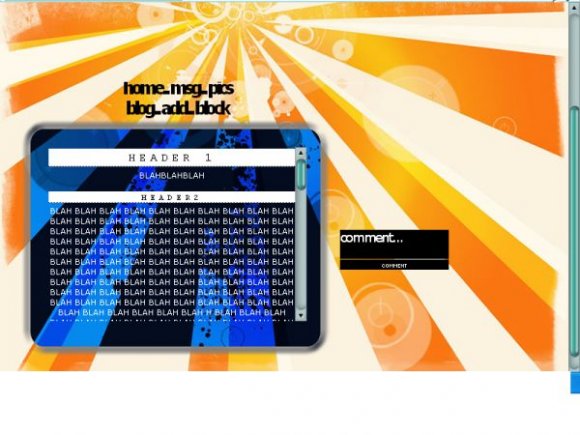
great colors, but i agree with everyone else about the navigation.

Love it, it's wild!! BITCHINN!

I really love the colors, I think the blue and orange are working really well together. I just don't like the nav much... Other than that, nice layout! :D

very nice (:

the background and the effects to the orange rays looks pretty damn awesome, but the blue section for the content seems to be out of place along with the navigation and comment box. Maybe if you used the beige color in a lighter or darker semi transparent and used it to replace the inverted blue section it would flow and look much better in terms of colors. As for the navigation try aiming for a different font, maybe century gothic in a size 22 with the line space at -1.

eh
not a fan
Again, I don't like the navigation too much. The negative doesn't go with the orange and yellow. :/ Aside from those things, it's okay.

snazzy
Layout Details
| Designer |
jerrys9
|
| Submitted on | Nov 16, 2007 |
| Page views | 19,260 |
| Favorites | 106 |
| Comments | 18 |
| Reviewer |
tripvertigo
|
| Approved on | Nov 16, 2007 |