Designer's Comments
Look carefully for specific instructions
REPLACE ALL "TEXT HERE" WITH YOUR TEXT.
HTML KNOWLEDGE NEEDED!
Using This Layout
For specific instructions read designer's comments
- This is a div overlay layout, html knowledge required!
- 1. Log into myspace.com
- 2. Click on Edit Profile (Profile 1.0)
- 3. Copy (ctrl c) and paste (ctrl v) code to the specified fields
Layout Comments
Showing latest 10 of 17 comments

thank you. but this layout was mainly made for people who have short about me's. in internet explorer and in mozilla firefox the backgrounds are different, i've been working that out. the rectangle things started happening in a couple of my layouts, there is something in the code that is causing it and i haven't quite figured it out yet. thanks for your input though.

I love it. Less is more in my opinion. There are a few problems, though. First, the background colors don't match. I put this on my page and matched the colors up myself [c6c6c6], so it wasn't that big of a deal. Second, writing about myself is hard as hell because there's nothing stopping the font from spilling out of the content box. Last, there's a medium sized white rectangle kind of in the middle of the right side.
I can't get rid of that damn white rectangle for CRAP! I've been trying for the past hour.
I really like it how it is now. (:
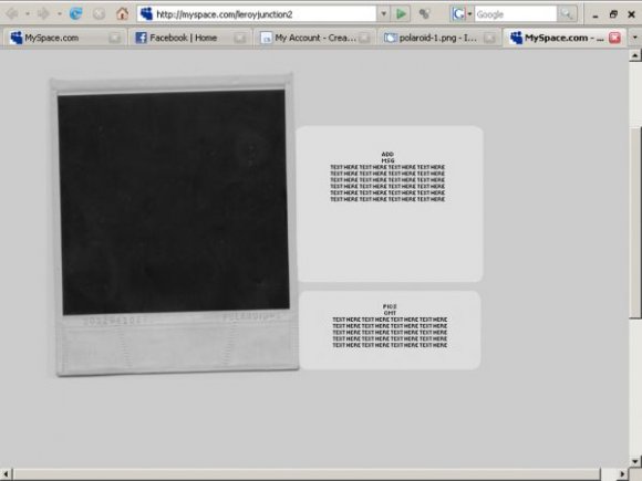
if you adjust this so the polaroid can be replaced, could ya please let me know.. i'm dying to use this one love it!
i'll get on it.
thanks
u should do it!!!!
it would have been tight as hell if u made it to where we could put our own picture in the poloriod and text at the bottom that would have been hott!!!!!

Loves it.
:]

this is just far too plain for me.

Nice but I think you should add a picture in the poloroid or some type of text....
Layout Details
| Designer |
leroyjunction
|
| Submitted on | Sep 15, 2007 |
| Page views | 51,532 |
| Favorites | 188 |
| Comments | 17 |
| Reviewer |
IVIike
|
| Approved on | Sep 16, 2007 |