Designer's Comments
Look carefully for specific instructions
Like this layout? Want more? Add us on myspace.
www.myspace.com/loveshacklayoutss
Using This Layout
For specific instructions read designer's comments
- This is a div overlay layout, html knowledge required!
- 1. Log into myspace.com
- 2. Click on Edit Profile (Profile 1.0)
- 3. Copy (ctrl c) and paste (ctrl v) code to the specified fields
Layout Comments
Showing latest 10 of 15 comments

I can't believe this got approved. I am positive that better looking layouts have been rejected while this got through. But you know what, I like your creativity. You did your own thing and you made it through:D I'm happy that you did this layout!

So cute

lol this is cute

very creative!

f them. YOUR WERE CREATIVE AND DID YOUR THING!
yu are truly a beautiful mind.

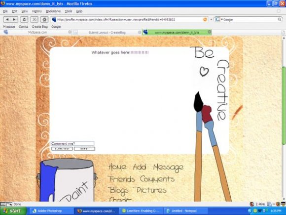
I really love the idea, but do you need to tell someone it's blue paint ? It does look a little rough around the edges, but I absolutely love the idea :]
I am so closeto liking this yet sofar! :(

Good idea, but badly executed. the background image looks misaligned and it looks like it was drawn on paint. Just needs a little work is all. nice start though. [:
Actually to the person below me, there is a background behind the main image. It must not have loaded for you?
That is a good way of thinking creative but the layout has no background color. The myspace default background makes it look crappy and I think you could have mixed the links around the page instead of squeezes together at the bottom. I see what your getting at. Nice job though.
Layout Details
| Designer |
GunsNRachel
|
| Submitted on | Aug 1, 2007 |
| Page views | 52,171 |
| Favorites | 314 |
| Comments | 15 |
| Reviewer |
freeflow
|
| Approved on | Aug 2, 2007 |