Designer's Comments
Look carefully for specific instructions
Layout Comments
Showing latest 9 of 9 comments

i agree with all yall, It was my first layout and I wanted it to look pretty! Im gonna change it completly! Im really really sorry it sucks!!

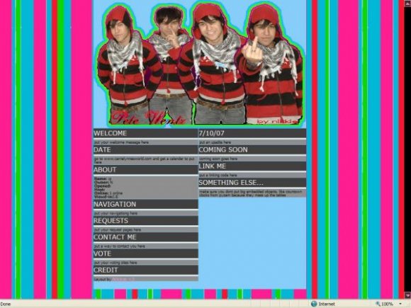
im sorry i really don't like this layout. the outlines are choppy and the tables and the backgound don't go good together

I honestly don't like the background.

it's too busy..i think. and the outlining colors aren't that great either. :/ it's okay though.

the outline on the border looks kinda..i dunno it's kinda pixelated, and the hover links with the sparkly doesnt really float my boat. other than that great layout!

The banner looks really pixely/rough, and the two strokes around the Pete's look odd, too. Also, the content area looks really crowded. Not to mention, the colors you used for this layout were not good at all. But please make more, if this one was just practice. :]

you did this in ms paint didnt ya? b/c the graphics are kind of grainy...
i like pete wentz thought

i don't really like the neon colors against the black & red of his shirt...i think it would be better if the colors coordinated a bit more (though the gray was fine)....
i also agree with the other comment about the graphic cutting, it is bit choppy...
good try though!
i like the way you did the tables..

that grey go with the bright colors
and the cutting of the dude is pretty bad... their pretty rough around the edges.... the contents neat and thats good... but the graphics of the layout isn't the best
if u can't cut images i suggest looking for psds or png images of cut outs of actors, singers, actresses... etc
Layout Details
| Designer |
NikkieShella
|
| Submitted on | Jul 12, 2007 |
| Page views | 8,719 |
| Favorites | 7 |
| Comments | 9 |
| Reviewer |
mzkandi
|
| Approved on | Jul 12, 2007 |