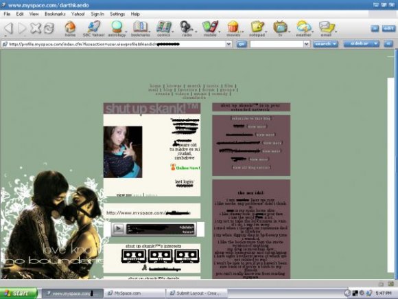
Designer's Comments
Look carefully for specific instructions
My fist submission. Please don't take off the credit (it's minscule anyways), and don't jack the background image because I made it myself. Contact table is hidden, if you want it unhidden find this code and take it out:
.contactTable {display:none!important; border:0px !important;}
It might stretch the layout, though. I suggest leaving the contact table off.
*EDIT* I changed the font size because I realized how unreadable it was.
.contactTable {display:none!important; border:0px !important;}
It might stretch the layout, though. I suggest leaving the contact table off.
*EDIT* I changed the font size because I realized how unreadable it was.
Using This Layout
For specific instructions read designer's comments
- 1. Log into myspace.com
- 2. Click on Edit Profile (Profile 1.0)
- 3. Copy (ctrl c) and paste (ctrl v) code to the specified fields
Layout Comments
Showing latest 10 of 11 comments

Wrong layout, my bad.
By Ju5tin on Jul 23, 2009 7:22 pm
This is my current layout, I really like it a lot. Good job!
By Ju5tin on Jul 23, 2009 7:19 pm

Hey your pic is ace!
By EllE4 on Aug 1, 2007 12:04 pm

I don't like the right table color.
By YourSuperior on Jul 11, 2007 3:45 am

kind of weird for my taste, i think it would've done better with a smaller text :]
By guccci on Jul 9, 2007 9:28 pm

lol, I was going to change the font size but i was so tired last night that I just left it alone. and the copyright box should be in the top right corner...
By bustedd on Jul 9, 2007 7:18 pm

i agree on the font
but pretty cool pic
By Blaqheartedstar on Jul 9, 2007 6:04 pm

Cute.
By schizo on Jul 9, 2007 2:44 pm

I well like this, the image is class. [:
By hospitalhorror on Jul 9, 2007 2:15 pm

The font is a little hard to read on the background...
Cool colors and image though ^_^
By FoxLucky on Jul 9, 2007 9:26 am
