Designer's Comments
Look carefully for specific instructions
Feel free to change the fonts and what not as long as you know how.
Layout Comments
Showing latest 9 of 9 comments

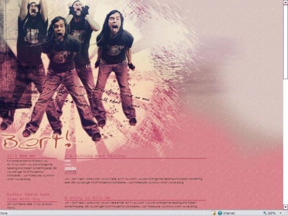
Weird. The font doesn't look like Courier; looks like Century Gothic or Arial, or maybe Lucinda Console. Courier letters look like short wide, thin letters.I didn't see that but I guess I need glasses. Ha ha. I like this layout. The colors are wicked and yummy! That guy is scary.

this kicks ass thanks (:
ima use it for my free webs account

ooooo...Bert's so smexy mann!

I love this, I love him. So, so much. Not in an "I wanna fuck him hard" way... Lol.
The Used are amazing.

i lvoe this layout.hes my hero.lol.

Nice colours! :) Yeah, Courier does not belong on this layout. I'd rather you use Times New Roman.

weird that the layout stretches pretty far down, but even though i don't know who the dude is, its a pretty decent layout
I like the colors and the brushes =)

This one's alright. But the Courier font for the dividers just bugs me. Other than that, I guess it looks clean. :]
Layout Details
| Designer |
adolelolz
|
| Submitted on | Jun 6, 2007 |
| Page views | 6,817 |
| Favorites | 18 |
| Comments | 9 |
| Reviewer |
alovesopure
|
| Approved on | Jun 6, 2007 |