Using This Graphic
Copy and paste one of the code below
URL Link - Email & IM
HTML - Websites & Blogs
BBcode - Forums & Bulletin Boards
Save File - My Computer
Right click and Save Target As...Graphic Comments
Showing latest 5 of 5 comments

the font is so-so, but good job nonetheless. :D
By ekiina on Jul 31, 2008 7:32 am

this looks great. :] i agree about the text too, lol.
By aaayotiffany on Jul 31, 2008 12:04 am

thanx guys constuctive criticism is always cool :)
By T0UCHMEART on Jul 30, 2008 11:19 pm

Yeah, I agree about the text.
Maybe if it was over their heads instead it'd look better.
It's still a good graphic though.
Love Paramore. =]
By so-sarcastic on Jul 30, 2008 9:04 pm

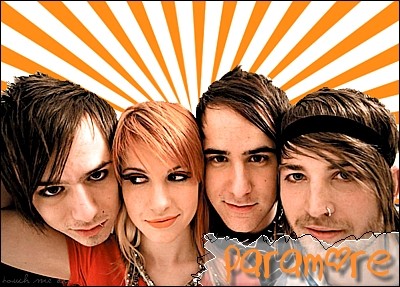
haha i like the sunburst effect, but not so much the area around the text.
By futura on Jul 30, 2008 8:05 pm
Graphic Details
| Designer |
T0UCHMEART
|
| Submitted on | Jul 28, 2008 |
| Page views | 1,623 |
| Favorites | 5 |
| Comments | 5 |
| Dimensions | 400 x 287 |
| Reviewer |
manny-the-dino
|
| Approved on | Jul 30, 2008 |