Using This Graphic
Copy and paste one of the code below
URL Link - Email & IM
HTML - Websites & Blogs
BBcode - Forums & Bulletin Boards
Save File - My Computer
Right click and Save Target As...
Graphic Comments
Showing latest 2 of 2 comments

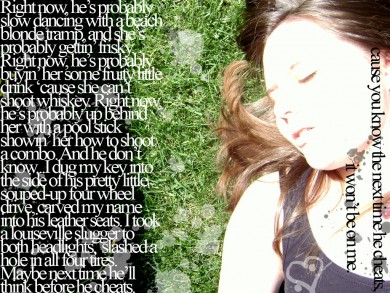
Yeah. I agree with alvin. I think it would have looked better if you just made like one quote in the middle of the image =)
By IBangBaby on Jul 8, 2007 11:02 pm

I like the photograph, but I honestly don't like the text. It kind of makes it look crowded.
By YourSuperior on Jul 8, 2007 5:00 pm
Graphic Details
| Designer |
takle_monster
|
| Submitted on | Jul 7, 2007 |
| Page views | 2,210 |
| Favorites | 7 |
| Comments | 2 |
| Dimensions | 1024 x 768 |
| Reviewer |
mzkandi
|
| Approved on | Jul 8, 2007 |
Photo Information
| Taken on | Jul 7, 2007 8:55 am |
| Camera | SONY DSC-S650 |
| Exposure | 1/160 sec |
| Aperture | f/5.6 |
| Focal length | 5.8 mm |
| Exposure bias | 0/167772160 EV |
| ISO speed | 100 |
| Flash | Flash did not fire, compulsory flash mode |