----- timeless inspiration, WARNING: MASSIVE LOADING TIME |
Resource Center Links
This Month's Contests | Hosts Looking for Hostees | Hostees looking for Hosts | BigBookofResources
Submission Guidelines

 Nov 27 2004, 11:35 PM Nov 27 2004, 11:35 PM
Post
#1
|
|
 We are the cure.  Group: Staff Alumni Posts: 4,936 Joined: Jan 2004 Member No: 1,456 |
|
|
|
|


 |
Replies
(1 - 15)
|
Nov 28 2004, 12:17 AM
Post
#2
|
|
 Senior Member Group: Staff Alumni Posts: 7,025 Joined: Feb 2004 Member No: 4,051 |
i <3 it nick! like usual. its really good! but why are the links orange? everything else is great though! You'll be getting my vote!
|
|
|
|

|
Nov 28 2004, 12:37 AM
Post
#3
|
|
 Um....Its meeee Group: Member Posts: 2,218 Joined: Mar 2004 Member No: 8,264 |
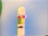
I like it, but why have the picture very long? Your only using half the space? Nice job though.

|
|
|
|
|
Nov 28 2004, 12:46 AM
Post
#4
|
|
|
We are the cure. Group: Staff Alumni Posts: 4,936 Joined: Jan 2004 Member No: 1,456 |
QUOTE(Gypsy Eyes @ Nov 28 2004, 12:17 AM) i <3 it nick! like usual. its really good! but why are the links orange? everything else is great though! You'll be getting my vote! You're right. I thought a contrasting color would be better. I just changed it. |
|
|
|
|
Nov 28 2004, 12:49 AM
Post
#5
|
|
|
define our lives for us. Group: Staff Alumni Posts: 11,656 Joined: Aug 2004 Member No: 43,293 |
mm i like it =) the colors all match and i like the font... boy that's the only font i always use

|
|
|
|

|
Nov 28 2004, 12:55 AM
Post
#6
|
|
 skaters gonna skate. Group: Official Member Posts: 6,861 Joined: Mar 2004 Member No: 6,336 |
oh. i like it.
|
|
|
|


|
Nov 28 2004, 03:01 AM
Post
#7
|
|
 Senior Member Group: Member Posts: 1,239 Joined: May 2004 Member No: 15,253 |
wow. sexy. I love the color
|
|
|
|
|
Nov 28 2004, 03:22 AM
Post
#8
|
|
 kelly[changed] 2 liz Group: Member Posts: 525 Joined: Oct 2004 Member No: 55,472 |
QUOTE(Jus2s1mp13 @ Nov 28 2004, 1:37 AM) I like it, but why have the picture very long? Your only using half the space? Nice job though. thats what i was thinking |
|
|
|
|
Nov 28 2004, 03:24 AM
Post
#9
|
|
|
We are the cure. Group: Staff Alumni Posts: 4,936 Joined: Jan 2004 Member No: 1,456 |
QUOTE(addictedtoxangie @ Nov 28 2004, 3:22 AM) thats what i was thinking  Why, is there a maximum height? Why, is there a maximum height?
|
|
|
|
|
Nov 28 2004, 04:32 AM
Post
#10
|
|
|
Brie Group: Staff Alumni Posts: 10,172 Joined: Jun 2004 Member No: 20,548 |
I looooooooooooooooooooooooooooooove it. :D
|
|
|
|

|
Nov 28 2004, 04:35 AM
Post
#11
|
|
 :hammer: Group: Staff Alumni Posts: 9,849 Joined: Mar 2004 Member No: 7,700 |
The way the slices load is cool.. haha it's like swoosh swoosh swoosh BAM ! There's abstract for ya.
Hmm the bottom-right part of the picture seems neglected. Like it's just dark mediterranean blue and black.. while the other parts of the pictures of more vibrant colors and blah. I hope you know what I mean. I like this layout though :D And I shouldn't be criticizing it because I can't do better.. meh. Great job! |
|
|
|

|
Nov 28 2004, 11:28 AM
Post
#12
|
|
|
WWMD?! - i am from the age of BM 2 Group: Member Posts: 5,308 Joined: Mar 2004 Member No: 8,848 |
^ i kinda already said the same thing as her before, so yea. you know my comments on it.
swoosh swoosh BAM, man. |
|
|
|
|
Nov 28 2004, 02:11 PM
Post
#13
|
|
 ^ I might look scary but i'm the nicest person in cb! Group: Member Posts: 1,364 Joined: Feb 2004 Member No: 4,979 |
u slice it to much...283 time plus the spacer!
i slice 17 time and i already get tire of uploading it. IT seem so empty. a big picture with 1 gray box. |
|
|
|

|
Nov 28 2004, 05:43 PM
Post
#14
|
|
 Senior Member Group: Member Posts: 429 Joined: Nov 2004 Member No: 66,993 |
really nice and creative! great colors
|
|
|
|
|
Nov 28 2004, 05:47 PM
Post
#15
|
|
 DANG forgot to add a border XD Group: Member Posts: 324 Joined: Nov 2004 Member No: 66,973 |
omg i love abstract layouts XD yours is awesome hehe i wish i could make those kind of things ^^
|
|
|
|
|
Nov 28 2004, 09:45 PM
Post
#16
|
|
|
Smile Like a Retard =D Group: Member Posts: 1,350 Joined: Nov 2004 Member No: 63,186 |
QUOTE I like it, but why have the picture very long? Your only using half the space? Nice job though. yeah, i agree... love the abstract a lot though =) |
|
|
|
 |
1 User(s) are reading this topic (1 Guests and 0 Anonymous Users)
0 Members: