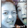
another one, i know it's simple |
Resource Center Links
This Month's Contests | Hosts Looking for Hostees | Hostees looking for Hosts | BigBookofResources
Submission Guidelines
  |

 Aug 3 2004, 05:01 PM Aug 3 2004, 05:01 PM
Post
#1
|
|
|
Member  Group: Member Posts: 13 Joined: Aug 2004 Member No: 36,545 |
i just keep changing it! lol. dont complain about how the scrollbar dont blend well, because i know the color code is exact
but for some reason it dotn blend in. oh well. creative criticism, please. xanga |
|
|
|


|
Aug 3 2004, 05:31 PM
Post
#2
|
|
 Yakuza Boss Group: Member Posts: 18 Joined: Jul 2004 Member No: 32,654 |
I still think pink doesn't go well with gray... sorry...

|
|
|
|
|
Aug 3 2004, 07:52 PM
Post
#3
|
|
 Senior Member Group: Staff Alumni Posts: 7,025 Joined: Feb 2004 Member No: 4,051 |
the images are cut out very poorly...
|
|
|
|

|
Aug 3 2004, 07:54 PM
Post
#4
|
|
 boogie down yo` Group: Member Posts: 710 Joined: Mar 2004 Member No: 9,271 |
the themez nice but kinda plain
|
|
|
|

|
Aug 3 2004, 07:57 PM
Post
#5
|
|
|
Senior Member Group: Member Posts: 148 Joined: Apr 2004 Member No: 14,145 |
eh not feelingthe pictures of you or whoever that is ..cuz the img. quality is bad.. but i like the font ..hehe pink does go with grey though haha
|
|
|
|
|
Aug 3 2004, 08:34 PM
Post
#6
|
|
 Senior Member Group: Member Posts: 633 Joined: May 2004 Member No: 19,353 |
did u take the pic with a quick cam and ya work on the cutting out
|
|
|
|
|
Aug 3 2004, 08:41 PM
Post
#7
|
|
 oh sweet pestilence Group: Member Posts: 2,251 Joined: Jun 2004 Member No: 22,876 |
Ok, here's what i think...the image quality is really bad. i dont really like how the navi's are pic. that are not labeled as to what they are. But i think you did a nice job on the cutting out of them.
 And the pink doesn't go with the gray. Sorry, but it needs some work. But it is a good start! And the pink doesn't go with the gray. Sorry, but it needs some work. But it is a good start! 
|
|
|
|
|
Aug 3 2004, 09:09 PM
Post
#8
|
|
|
Member Group: Member Posts: 13 Joined: Aug 2004 Member No: 36,545 |
the image quality isnt bad, theyre faded

|
|
|
|
|
Aug 3 2004, 09:39 PM
Post
#9
|
|
 ??? Group: Member Posts: 9 Joined: Jul 2004 Member No: 30,909 |
dont listen to what everyone else says, i think it was awesome! {though i just used a skin on mine}
|
|
|
|
|
Aug 3 2004, 10:16 PM
Post
#10
|
|
|
Senior Member Group: Member Posts: 176 Joined: Feb 2004 Member No: 5,556 |
=/ the gray and pink dont match.
|
|
|
|
|
Aug 3 2004, 10:58 PM
Post
#11
|
|
 Look its... Group: Official Member Posts: 5,817 Joined: Feb 2004 Member No: 4,767 |
the background looks real bad. change it
|
|
|
|
|
Aug 4 2004, 08:15 AM
Post
#12
|
|
 blah blah Group: Member Posts: 196 Joined: Jul 2004 Member No: 27,277 |
its nice. just maybe make the blog a bit wider cuz theres a bottom scrollbar.
|
|
|
|
|
Aug 4 2004, 12:08 PM
Post
#13
|
|
|
Senior Member Group: Member Posts: 1,013 Joined: Feb 2004 Member No: 4,930 |
QUOTE(Gypsy Eyes @ Aug 3 2004, 7:52 PM) the images are cut out very poorly... i agree and the image quality isnt good eithier. Also, the colors dont really match |
|
|
|
|
1 User(s) are reading this topic (1 Guests and 0 Anonymous Users)
0 Members: