Comming out of my shell. |
Resource Center Links
This Month's Contests | Hosts Looking for Hostees | Hostees looking for Hosts | BigBookofResources
Submission Guidelines
  |

 Jun 19 2010, 11:37 PM Jun 19 2010, 11:37 PM
Post
#1
|
|
 Senior Member  Group: Member Posts: 113 Joined: Jan 2009 Member No: 712,185 |
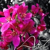
When I design things I most of the time do them the same way and they get pretty boring so I decided that I am comming out of my shell and trying something new!! C&C would be beautiful!!!! The picture is a thumbnail so just click on it to see all of it! :D
 |
|
|
|


|
Jun 20 2010, 01:14 AM
Post
#2
|
|
 Senior Member Group: Administrator Posts: 8,629 Joined: Jan 2007 Member No: 498,468 |
The image quality is pretty good but I think you need to work on your blending (it's obvious where the images end). Also I personally don't like the font you used and the overuse of brushes. But it came out nice.
|
|
|
|


|
Jun 20 2010, 10:54 AM
Post
#3
|
|
|
Senior Member Group: Staff Alumni Posts: 4,665 Joined: Aug 2008 Member No: 676,364 |
I'm glad to see a blend that's actually on the right foot. Great quality images, a beginning base, and some sort of theme to it. I definitely agree with the others and all it is consistent practice and experimentation. After a couple months later you'll see a big improvement in your style.
|
|
|
|

|
Jun 20 2010, 12:59 PM
Post
#4
|
|
|
Senior Member Group: Member Posts: 113 Joined: Jan 2009 Member No: 712,185 |
Thank you all for the feedback!! so for making a better blend should i feather the edges more or what? cause i'm not quite sure what to do.
Heres a new one and i tryed to do kind of what you guys said, is it better or worse? 
|
|
|
|
|
Jun 20 2010, 09:36 PM
Post
#5
|
|
|
Senior Member Group: Staff Alumni Posts: 4,665 Joined: Aug 2008 Member No: 676,364 |
it's starting to look good.
|
|
|
|
|
Jun 20 2010, 09:41 PM
Post
#6
|
|
 Sex, Blood, & RocknRoll Group: People Staff Posts: 5,305 Joined: Nov 2007 Member No: 596,480 |
I like the color. and the blending is better. but the font and brushes are still really bad. The way the font looked in the first one looks much better then the one in this one.
i ruv JM |
|
|
|

|
Jun 20 2010, 09:45 PM
Post
#7
|
|
 Group: Staff Alumni Posts: 7,020 Joined: May 2008 Member No: 653,768 |
...ew
Reason for edit: Posting member's pic without permission. -Beenly
|
|
|
|

|
Jun 20 2010, 09:51 PM
Post
#8
|
|
|
Sex, Blood, & RocknRoll Group: People Staff Posts: 5,305 Joined: Nov 2007 Member No: 596,480 |
damn it Steven.

|
|
|
|
|
Jun 20 2010, 09:56 PM
Post
#9
|
|
|
Senior Member Group: Member Posts: 113 Joined: Jan 2009 Member No: 712,185 |
thanks for the feedback!! okayy i'll work on the font choosing then.
QUOTE ...ew ...thank you? |
|
|
|
|
Jun 22 2010, 05:49 PM
Post
#10
|
|
 사랑해 ~ 我愛你 ♥ Group: Design Staff Posts: 825 Joined: Jan 2007 Member No: 492,587 |
Second one looks much better. Agree with Abbey (spambot) about the brushes and font.
|
|
|
|

|
1 User(s) are reading this topic (1 Guests and 0 Anonymous Users)
0 Members: