very foine c h i n g y |
Resource Center Links
This Month's Contests | Hosts Looking for Hostees | Hostees looking for Hosts | BigBookofResources
Submission Guidelines
  |

 Jul 16 2004, 06:12 PM Jul 16 2004, 06:12 PM
Post
#1
|
|
|
....  Group: Member Posts: 480 Joined: May 2004 Member No: 18,055 |
|
|
|
|


|
Jul 16 2004, 06:21 PM
Post
#2
|
|
 fragile Group: Member Posts: 1,044 Joined: Mar 2004 Member No: 9,807 |
ohhh i like your xanga
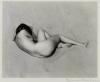
very chingy....nice banner also |
|
|
|
|
Jul 16 2004, 06:22 PM
Post
#3
|
|
|
.... Group: Member Posts: 480 Joined: May 2004 Member No: 18,055 |
tee hee why thank you=P
|
|
|
|
|
Jul 16 2004, 06:55 PM
Post
#4
|
|
 moderngirly Group: Member Posts: 406 Joined: Jun 2004 Member No: 19,597 |
ehh i dont like blinkie boxes that much...and try to make the rest of ur blog the same width as the banner.
 thats a hot banner u got there tho.. thats a hot banner u got there tho..
|
|
|
|


|
Jul 16 2004, 06:56 PM
Post
#5
|
|
|
Senior Member Group: Member Posts: 646 Joined: Jul 2004 Member No: 30,847 |
very cool *singz w. the song* hehe
|
|
|
|
|
Jul 16 2004, 09:47 PM
Post
#6
|
|
 your signal fades away, and all I'm left with is noise. Group: Member Posts: 2,099 Joined: Apr 2004 Member No: 14,110 |
nice layout!!! i love chingy lol
|
|
|
|
|
Jul 16 2004, 11:00 PM
Post
#7
|
|
 XOTY*06 :D Group: Member Posts: 2,635 Joined: Mar 2004 Member No: 6,747 |
i like what you did to the pic....a bit defaultish

|
|
|
|

|
Jul 16 2004, 11:57 PM
Post
#8
|
|
 I will spin you to sugar. Group: Member Posts: 416 Joined: Jun 2004 Member No: 22,843 |
1. the banner looks good
2. blinky boxes annoy me 3. make the width of your blog as the same width as your image 4. default. 5. why is there brown in your scrollbar hope that helps. 
|
|
|
|
|
Jul 17 2004, 12:18 AM
Post
#9
|
|
 shaving ryan's privates. Group: Member Posts: 212 Joined: Jul 2004 Member No: 30,902 |
nice banner!
|
|
|
|
|
Jul 17 2004, 12:24 AM
Post
#10
|
|
 Senior Member Group: Member Posts: 633 Joined: May 2004 Member No: 19,353 |
ya i like the banner
|
|
|
|
|
Jul 17 2004, 02:20 AM
Post
#11
|
|
 megumi tanaka Group: Official Designer Posts: 379 Joined: May 2004 Member No: 18,715 |
you really should make the blog the same width as your banner
the text all moves around when you hover on a link... i can't click on anything in the modules It looks better if the blog and the modules have the same style, colors, sizes, etc... yours are all different and they look weird so close together. they should also be aligned so the top borders are lined up.. then everything will be perfect 8/10 |
|
|
|

|
Jul 17 2004, 05:42 AM
Post
#12
|
|
 Senior Member Group: Member Posts: 3,077 Joined: Feb 2004 Member No: 3,904 |
Nice banner. Smooth with good blending. It'll look better without the blink boxes. And also if your blog and left modules were the same width as your banner.
|
|
|
|
|
1 User(s) are reading this topic (1 Guests and 0 Anonymous Users)
0 Members: