graphic c&c |
Resource Center Links
This Month's Contests | Hosts Looking for Hostees | Hostees looking for Hosts | BigBookofResources
Submission Guidelines

 Jul 29 2009, 04:36 PM Jul 29 2009, 04:36 PM
Post
#1
|
|
 Sniff, sniff, hooray!  Group: Member Posts: 71 Joined: Mar 2006 Member No: 388,396 |
So I was about to submit this, but I wanted some feedback on how i can improve on this or if this looks okay and what not.
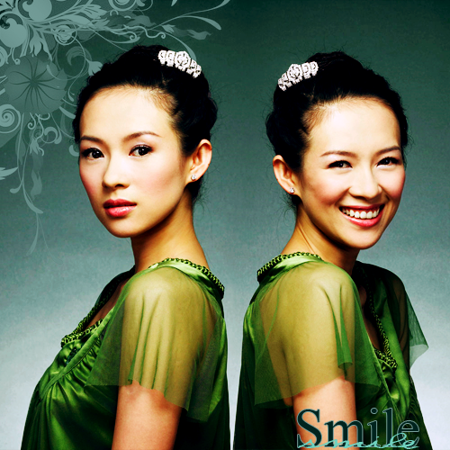 Should I choose a different font, or do you guys think it looks okay? |
|
|
|


 |
Replies
(1 - 14)
|
Jul 29 2009, 04:40 PM
Post
#2
|
|
 Live long and prosper. Group: Staff Alumni Posts: 10,142 Joined: Apr 2007 Member No: 514,926 |
Do something with the images, it looks like you just took two, and merged them together. And then put a brush and text.
|
|
|
|


|
Jul 29 2009, 04:45 PM
Post
#3
|
|
|
Sniff, sniff, hooray! Group: Member Posts: 71 Joined: Mar 2006 Member No: 388,396 |
^ I actually did do some coloring on them.
The original pictures were kind of dull. |
|
|
|
|
Jul 29 2009, 09:28 PM
Post
#4
|
|
 Senior Member Group: Administrator Posts: 8,629 Joined: Jan 2007 Member No: 498,468 |
Yeah maybe a bit more coloring would make this pop. The blending looks very good. I'm just not sure about the green you chose for the font and the placement.
|
|
|
|

|
Jul 29 2009, 09:42 PM
Post
#5
|
|
 show me a garden thats bursting to life Group: Staff Alumni Posts: 12,303 Joined: Mar 2005 Member No: 115,987 |
Font placement and it's just WAY too plain. It needs something more interesting in there.
|
|
|
|

|
Jul 29 2009, 09:44 PM
Post
#6
|
|
 (′ ・ω・`) Group: Official Designer Posts: 6,179 Joined: Dec 2004 Member No: 72,477 |
yes yes
you ruined it with the fonts. dont like the fonts. the placement is alright, but you could add something to make it look more interesting. |
|
|
|


|
Jul 29 2009, 10:02 PM
Post
#7
|
|
|
Sniff, sniff, hooray! Group: Member Posts: 71 Joined: Mar 2006 Member No: 388,396 |
Okay
so I changed the font and the placement of it, I added a texture, and I got rid of the brush in the top left corner and, added another brush. Is it looking any better or is it just going downhill? Thanks for the help  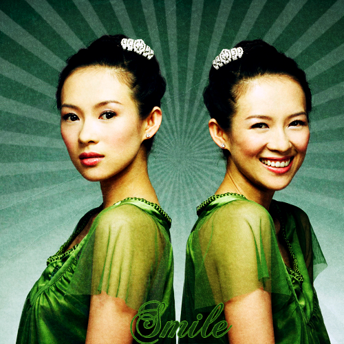 //edit Oh, and I changed the coloring slightly |
|
|
|
|
Jul 29 2009, 10:06 PM
Post
#8
|
|
 Mel Blanc was allergic to carrots. Group: Official Designer Posts: 6,371 Joined: Aug 2008 Member No: 676,291 |
It has potential and I can grasp the concept of it, but it looks a bit too basic. It's like, take two images, cob them out, apply coloring, add a background texture with some brushes, and some random fonts. :\ The font, imo, should look a bit more idk "happy" to kind of give off the "smile" concept. Also, I think you should change the colors of the background and the brushes to something more brighter, like an orange-ish color. Otherwise, it's pretty good.  edit: Ok, the sunburst thing is pretty cool but I still think you should have some more warmer colors in the background. The font looks pretty choppy too and it's also hard to read kind of. The images also look kind of over sharpened. :\ |
|
|
|

|
Jul 29 2009, 10:13 PM
Post
#9
|
|
|
Sniff, sniff, hooray! Group: Member Posts: 71 Joined: Mar 2006 Member No: 388,396 |
yeah, I really don't like the font myself xP
actually, I think it looks over sharpened because of the texture. I'll play around with some colors for the background, and hopefully I'll find a better font 
|
|
|
|
|
Jul 29 2009, 10:17 PM
Post
#10
|
|
|
Mel Blanc was allergic to carrots. Group: Official Designer Posts: 6,371 Joined: Aug 2008 Member No: 676,291 |
Oh, you don't have to remove the entire texture though, you can just erase over her on the texture layer.
|
|
|
|
|
Jul 29 2009, 10:45 PM
Post
#11
|
|
 Senior Member Group: Staff Alumni Posts: 2,435 Joined: Feb 2007 Member No: 506,205 |
The first version is way better. Sunbursts are so cliche, and the font looks even worse.
The first one is okay, but the background looks like it needs to be smoothed out, especially around the back of the heads. I think it would be nice if you added some color blotches of the green in her shirt as well. |
|
|
|

|
Jul 29 2009, 10:59 PM
Post
#12
|
|
 kthxbai Group: Official Designer Posts: 2,832 Joined: Feb 2008 Member No: 621,203 |
QUOTE(schizo @ Jul 29 2009, 10:45 PM)  The first version is way better. Sunbursts are so cliche, and the font looks even worse. Yep.... andddddddddddddd! I think the text ruins it altogether.... I hate images that say random shit like "DREAM!" or "LIVE. LAUGH. LOVE.!" especially "dream." that one is SOOOOOOO overused. |
|
|
|

|
Jul 29 2009, 11:13 PM
Post
#13
|
|
|
Sniff, sniff, hooray! Group: Member Posts: 71 Joined: Mar 2006 Member No: 388,396 |
Do you guys think I should just get rid of the text?
It kind of seems unnecessary now. |
|
|
|
|
Jul 29 2009, 11:14 PM
Post
#14
|
|
|
kthxbai Group: Official Designer Posts: 2,832 Joined: Feb 2008 Member No: 621,203 |
well, I mean, once you put text on it, it's not really usable for anything else, so why submit it?
|
|
|
|
|
Jul 29 2009, 11:18 PM
Post
#15
|
|
|
Sniff, sniff, hooray! Group: Member Posts: 71 Joined: Mar 2006 Member No: 388,396 |
yeah, I guess that's true.
I guess I'm done with this picture. Thanks for the help guys 
|
|
|
|
 |
1 User(s) are reading this topic (1 Guests and 0 Anonymous Users)
0 Members: