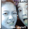
//_____ft. SE7EN, my 1st try at div layouts... |
Resource Center Links
This Month's Contests | Hosts Looking for Hostees | Hostees looking for Hosts | BigBookofResources
Submission Guidelines
  |

 Jul 10 2004, 11:27 PM Jul 10 2004, 11:27 PM
Post
#1
|
|
 i'm 11,386. back off BITCHES!!  Group: Member Posts: 1,596 Joined: Apr 2004 Member No: 11,386 |
its not great, i kno..but it took me like HOURSS!!! my first blend too...
MY XANGAAA anything i should improve on? oh yea, thx to jihyun for coding it for mee...^^v |
|
|
|


|
Jul 10 2004, 11:34 PM
Post
#2
|
|
 Senior Member Group: Member Posts: 3,077 Joined: Feb 2004 Member No: 3,904 |
The blend's quite good. Se7en is hawt. I like the colors. But the white text doesn't really suit though.
|
|
|
|
|
Jul 10 2004, 11:39 PM
Post
#3
|
|
 Senior Member Group: Member Posts: 633 Joined: May 2004 Member No: 19,353 |
its alright but on one of the 7s that are goin down on the screen is cut off
|
|
|
|
|
Jul 10 2004, 11:47 PM
Post
#4
|
|
|
Senior Member Group: Member Posts: 360 Joined: May 2004 Member No: 17,368 |
loosk really good.
i like the blend. |
|
|
|
|
Jul 11 2004, 12:36 AM
Post
#5
|
|
 I will spin you to sugar. Group: Member Posts: 416 Joined: Jun 2004 Member No: 22,843 |
Nicely done, but is the header supposed to have a beige line on the left side of it?
|
|
|
|
|
Jul 11 2004, 08:56 AM
Post
#6
|
|
|
i'm 11,386. back off BITCHES!! Group: Member Posts: 1,596 Joined: Apr 2004 Member No: 11,386 |
oh man...ur right..one of the words are cut off...=-[
poo... |
|
|
|
|
Jul 11 2004, 06:45 PM
Post
#7
|
|
 boogie down yo` Group: Member Posts: 710 Joined: Mar 2004 Member No: 9,271 |
wow .. that looks really nice .. but the banner/blend looks cut off on the right .. maybe add a strip of light brown .. or jus leave it .. watever you prefer .. nice job

|
|
|
|

|
Jul 11 2004, 06:53 PM
Post
#8
|
|
 ksjchskjdahfkja Group: Member Posts: 958 Joined: Jan 2004 Member No: 1,175 |
cool layout. i like the colors.
|
|
|
|
|
Jul 11 2004, 11:49 PM
Post
#9
|
|
 Senior Member Group: Member Posts: 1,239 Joined: May 2004 Member No: 15,253 |
AHHHHHHh se7en is so hot... =] i ADORE the banner and the fonts on there. i think the xanga ad is messing with some of the positioning but looks very very good. i like it!!

|
|
|
|
|
Jul 11 2004, 11:54 PM
Post
#10
|
|
 Senior Member Group: Member Posts: 37 Joined: Jul 2004 Member No: 28,816 |
i looks really nice for your first one.
|
|
|
|
|
Jul 12 2004, 01:33 AM
Post
#11
|
|
|
=] Group: Member Posts: 1,101 Joined: Feb 2004 Member No: 5,683 |
awesome banner
nice colors. good job
|
|
|
|
|
Jul 12 2004, 03:10 PM
Post
#12
|
|
 Natsumi is the XD Group: Member Posts: 915 Joined: Mar 2004 Member No: 8,203 |
that's very nice. I don't know who he/they are though ^^; I love the colors.
|
|
|
|
|
Jul 13 2004, 02:04 PM
Post
#13
|
|
|
i'm 11,386. back off BITCHES!! Group: Member Posts: 1,596 Joined: Apr 2004 Member No: 11,386 |
thx for the comments and suggestions.....i fixed it up a lil...
looks better ^__^v |
|
|
|
|
Jul 13 2004, 02:28 PM
Post
#14
|
|
 XOTY*06 :D Group: Member Posts: 2,635 Joined: Mar 2004 Member No: 6,747 |
nice blend. good job!
|
|
|
|

|
Jul 13 2004, 03:15 PM
Post
#15
|
|
 didn't lose my mind, i sold it Group: Member Posts: 385 Joined: Jul 2004 Member No: 28,372 |
it's ur first time using div? thats awesome, took me awhile till I figured how to do that. the banner is cool too
|
|
|
|
| *AngelicEyz00* |
Jul 13 2004, 03:52 PM
Post
#16
|
|
Guest |
o0oh..i like it... i think it's cute... who's that on the banner?
|
|
|
|
|
Jul 13 2004, 04:02 PM
Post
#17
|
|
|
Senior Member Group: Member Posts: 172 Joined: Jun 2004 Member No: 25,339 |
It's so cool! If Se7en is the guy on the bgm, imma look him up. He/They sound(s) kool!
|
|
|
|
|
Jul 14 2004, 10:08 PM
Post
#18
|
|
 <3 Group: Member Posts: 188 Joined: Feb 2004 Member No: 4,801 |
i think you did a great job on the banner & the layout.
|
|
|
|
|
Jul 14 2004, 10:11 PM
Post
#19
|
|
 Senior Member Group: Member Posts: 7,048 Joined: Jun 2004 Member No: 22,696 |
no it looks really nice but i no what i was just thinking was that u should change all those lucky 7's going downward to links to diff parts of ur xanga like guestbook and xanga and etc.
RATING: 9/10 |
|
|
|
|
Jul 14 2004, 11:44 PM
Post
#20
|
|
 megumi tanaka Group: Official Designer Posts: 379 Joined: May 2004 Member No: 18,715 |
i like everything but the top of the banner, it doesn't blend in to the background very nicely.
9/10 |
|
|
|


|
1 User(s) are reading this topic (1 Guests and 0 Anonymous Users)
0 Members: