First infographic |
Resource Center Links
This Month's Contests | Hosts Looking for Hostees | Hostees looking for Hosts | BigBookofResources
Submission Guidelines
 May 25 2009, 06:01 PM May 25 2009, 06:01 PM
Post
#1
|
|
 Senior Member      Group: Official Designer Posts: 339 Joined: Mar 2009 Member No: 721,527 |
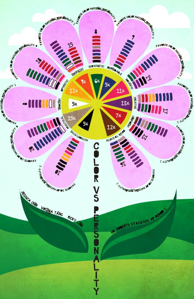
This is for my statistics final project of sorts. Basically we have to make a survey of our own and the topic my group wanted to do was... to see if a person's favorite color determines their personality.
So each small bar represents one person and the color that they chose to be their favorite color, lined up with the personality that they chose to most closely represent them. I want to try to keep the elaborations to a minimum because I want to see if a fresh set of eyes looking at it for the first time would understand it without any explanations. 
|
|
|
|
Posts in this topic
 rickysaurus First infographic May 25 2009, 06:01 PM
 Tomates i like it a lot. My one thing is that its kinda ha... May 25 2009, 07:11 PM

 jcp QUOTE(Tomates @ May 25 2009, 07:11 PM) i ... May 25 2009, 08:15 PM

 emberfly QUOTE(Tomates @ May 25 2009, 07:11 PM) i ... May 29 2009, 01:13 AM
 digitalfragrance This is awesome!!! I really don't... May 25 2009, 08:14 PM
 IWontRapeYou The only thing I think you should change is the fo... May 25 2009, 09:51 PM
 interpretation Interesting. I like the idea of putting the bars o... May 25 2009, 10:09 PM
 schizo It looks fantastic, as usual. I kinda agree about ... May 25 2009, 10:42 PM
 rickysaurus Thanks for the feedback. I'll bring the font s... May 26 2009, 12:30 AM
 manny-the-dino Oh my gosh this is such a cute idea! I like it... May 26 2009, 01:33 AM
 rickysaurus Update: May 26 2009, 02:42 AM
 livwho Better, but the black words on the petals crowd th... May 26 2009, 12:07 PM
 Mikeplyts It looks great as usual, but it's still a bit ... May 26 2009, 04:52 PM
 ForgiveTheSinner Actually I was a bit confused reading it...maybe I... May 26 2009, 05:21 PM
 manny-the-dino It looks crowded, imo. I think I liked your first ... May 26 2009, 05:46 PM
 IWontRapeYou I think maybe if the white text was justified it w... May 26 2009, 06:08 PM
 rickysaurus Update: May 27 2009, 09:23 PM
 manny-the-dino Hmm I think it's cute. I can't really find... May 27 2009, 11:25 PM
 IWontRapeYou I think it's great. Is everyone in the class m... May 27 2009, 11:46 PM
 rickysaurus Nah, it's just me, because I'm not good at... May 28 2009, 05:25 PM

 schizo QUOTE(rickysaurus @ May 28 2009, 05:25 PM... May 28 2009, 10:57 PM
 rickysaurus RE: First infographic May 28 2009, 09:39 PM
 Pooonani These are all too pretty :x -Jealous-
The bee line... May 28 2009, 09:48 PM
 rickysaurus why do i see so many boobies avatars from that gir... May 28 2009, 09:50 PM
 IWontRapeYou lol I had it because I like the word boobies, she ... May 28 2009, 09:53 PM
 rickysaurus i like boobies too. i mean the word. lol. May 28 2009, 10:02 PM
 rickysaurus Thanks uhm Abbey right? and schizo... I haven... May 28 2009, 11:42 PM

 schizo QUOTE(rickysaurus @ May 28 2009, 11:42 PM... May 29 2009, 01:57 PM
 rickysaurus With more legibility: May 29 2009, 03:01 AM
 emberfly 1. You spelled PRACTICAL incorrectly in the Legend... May 29 2009, 03:27 AM
 lovescream I think the design of it is extremely creative and... May 29 2009, 08:26 AM
 ley Wow! Talk about creative I liked it better w... May 29 2009, 02:05 PM
 rickysaurus Alright I corrected the type errors that emberfly ... May 31 2009, 01:24 AM
 emberfly the "8" over the innocent girl's hea... May 31 2009, 01:30 AM
 IWontRapeYou Oh my gosh I love it! May 31 2009, 01:32 AM
 manny-the-dino Woah this is so cool. I love it! May 31 2009, 01:59 AM
 rickysaurus Thanks guys :] May 31 2009, 02:13 AM
 Mikeplyts Oooo, niicce!! It looks awesome! :DD May 31 2009, 08:49 AM
  |
1 User(s) are reading this topic (1 Guests and 0 Anonymous Users)
0 Members:


