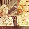
New Icons :), Just made some new icons! |
Resource Center Links
This Month's Contests | Hosts Looking for Hostees | Hostees looking for Hosts | BigBookofResources
Submission Guidelines
  |
 May 6 2009, 07:09 AM May 6 2009, 07:09 AM
Post
#1
|
|
|
Sunshine07   Group: Member Posts: 22 Joined: Oct 2008 Member No: 690,489 |
Hi guys and gals...I'm a beginner at making icons and I tried and just made some new icons today and I'd like to get some C & C. =]
Here they are : 1. 2. 3. Thanks! =) |
|
|
|
 May 6 2009, 07:52 AM May 6 2009, 07:52 AM
Post
#2
|
|
 Candy & Cookie Tester    Group: Member Posts: 76 Joined: Apr 2009 Member No: 724,880 |
I like number 2! The colors are nice!.
|
|
|
|
 May 6 2009, 10:59 AM May 6 2009, 10:59 AM
Post
#3
|
|
 Senior Member     Group: Member Posts: 113 Joined: Jan 2009 Member No: 712,185 |
these are really good! i love the colors and everything is really good :]
|
|
|
|
 May 6 2009, 02:21 PM May 6 2009, 02:21 PM
Post
#4
|
|
|
Senior Member       Group: Official Member Posts: 1,288 Joined: Oct 2007 Member No: 585,380 |
|
|
|
|
| *Janette* |
 May 6 2009, 03:08 PM May 6 2009, 03:08 PM
Post
#5
|
|
Guest |
I like them all. Something about the G-clef in the first one bugs me though.
|
|
|
|
 May 6 2009, 06:38 PM May 6 2009, 06:38 PM
Post
#6
|
|
 Senior Member       Group: Staff Alumni Posts: 2,435 Joined: Feb 2007 Member No: 506,205 |
They're really pretty, especially the second one.
The other ones you submitted are really good, too. Why didn't you post those? |
|
|
|
 May 6 2009, 07:37 PM May 6 2009, 07:37 PM
Post
#7
|
|
|
Senior Member        Group: Staff Alumni Posts: 4,665 Joined: Aug 2008 Member No: 676,364 |
These icons have excellent qualities! However, I' don't like playing the devil's advocate, but..
1st iCon; G-clef is okay, but maybe lowering the opacity wouldn't make it too noticeable. I also think that the yellowish-brownish texture on her face is a bit troubling. Maybe next time try to erase any smudges or things that's focusing on a subject? 2nd iCon; Coloring is very pretty. Howeveer, I think the tiny text could be moved a little bit. Somewhere that it won't conceal any shapes that could add a stylish effect to your images. The polka dots in this image seems to be left out, and I think without the tiny text, the image wouldn't be too obvious. Also, the dotted lines near the bottom seems to be awkward. Correct me if I don't see a special style, but what does the dotted lines suppose to represent for the icon? 3rd iCon; Not much to say but a good icon. Although, I wonder why the dotted pattern seems to be curved? |
|
|
|
 May 6 2009, 07:48 PM May 6 2009, 07:48 PM
Post
#8
|
|
 Senior Member        Group: Administrator Posts: 8,629 Joined: Jan 2007 Member No: 498,468 |
These are all really pretty. I'm not sure which one is my favorite but I'll say number 3. :)
|
|
|
|
 May 6 2009, 08:27 PM May 6 2009, 08:27 PM
Post
#9
|
|
 Mel Blanc was allergic to carrots.        Group: Official Designer Posts: 6,371 Joined: Aug 2008 Member No: 676,291 |
They looks really good for a beginner! I like the second one the most but I agree with Beenly that you should just kind of move the tiny text a bit toward the left and down some. The dotted line kind of takes away from the second one but I like the dotted line in the 3rd one. G-Clef in the first one could have lower opacity and maybe even a texture. Otherwise, great job!
|
|
|
|
 May 7 2009, 08:44 AM May 7 2009, 08:44 AM
Post
#10
|
|
|
Sunshine07   Group: Member Posts: 22 Joined: Oct 2008 Member No: 690,489 |
Thanks you everyone for your comments!
I appreciate it! It helped me improve a lot! :D Yeah, I considered lowering the opacity for the G-clef in the first image, but I thought it looked good the way it is now. Thanks, anyways! :D |
|
|
|
  |
1 User(s) are reading this topic (1 Guests and 0 Anonymous Users)
0 Members:


