justice div. |
Rating


|
Resource Center Links
This Month's Contests | Hosts Looking for Hostees | Hostees looking for Hosts | BigBookofResources
Submission Guidelines
 Jan 11 2009, 04:35 PM Jan 11 2009, 04:35 PM
Post
#1
|
|
 Senior Member  Group: Member Posts: 351 Joined: Jul 2007 Member No: 543,127 |
so i made this for my friend.
http://profile.myspace.com/index.cfm?fusea...endID=356250685 just want some criticism cause i know he'd just say "its great!" or whatever even if he thinks its horrible. so be as harsh as you want.  |
|
|
|


 |
Replies
(1 - 9)
|
Jan 11 2009, 06:22 PM
Post
#2
|
|
 Sex, Blood, & RocknRoll Group: People Staff Posts: 5,305 Joined: Nov 2007 Member No: 596,480 |
Everything is aligned for me in FF, and the links work but they open in a new tab which is kind of annoying. I can't say I really like the colors either. And the fade/drop shadow is cutoff o the right side.
|
|
|
|


|
Jan 11 2009, 06:23 PM
Post
#3
|
|
 Senior Member Group: Official Member Posts: 2,936 Joined: Sep 2008 Member No: 683,235 |
Like TJ said, it's really misaligned. I also really dislike the font you used, and it's not the best quality.
|
|
|
|

|
Jan 11 2009, 06:25 PM
Post
#4
|
|
 Senior Member Group: Official Designer Posts: 312 Joined: Dec 2007 Member No: 597,269 |
Everything looks horrible to me in Opera..
and the glow swirl things was done horridly they are all over the place and messed up =/ And the headers and nav is gross looking.. I also hate the comment box. |
|
|
|


|
Jan 11 2009, 06:25 PM
Post
#5
|
|
|
Senior Member Group: Official Member Posts: 2,936 Joined: Sep 2008 Member No: 683,235 |
^i think the swirls were meant to be messy.
|
|
|
|
|
Jan 11 2009, 07:14 PM
Post
#6
|
|
|
Senior Member Group: Member Posts: 351 Joined: Jul 2007 Member No: 543,127 |
okay. thank you.
i think im just gonna start all over with this one then. the swirls were supposed to be messy and that was the font and colors he wanted them to so yea. oh yea, i started coding a different layout without thinking that i posted this and i think thats what decaydance saw, but im not sure. cause there was a random box and stuff. im not sure how to make it not pop up in a tab. idk why it does that... |
|
|
|
|
Jan 13 2009, 04:39 PM
Post
#7
|
|
|
Newbie Group: Member Posts: 6 Joined: Jan 2009 Member No: 709,000 |
i think that it's a very good layout all and all, but you need to watch the quality of your pictures. they don't look their best. =/ sides that, great job.
|
|
|
|
|
Jan 13 2009, 11:16 PM
Post
#8
|
|
 Senior Member Group: Official Designer Posts: 5,880 Joined: Nov 2007 Member No: 593,382 |
Its aligned for me? But besides that stuff...there a randomn blank space above the comment box and the pink and green is too contrasting.
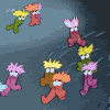
And its a little plain. But i like the guys and the swirls around them! |
|
|
|

|
Jan 14 2009, 04:37 PM
Post
#9
|
|
 Mel Blanc was allergic to carrots. Group: Official Designer Posts: 6,371 Joined: Aug 2008 Member No: 676,291 |
Yeah, the swirls are kind of cool but the colors used are just really clashing. Maybe you could change the bg color of the main box so that it doesn't make the other colors look so disgusting. Also, I don't like the font used and the links won't work. Try again.

|
|
|
|

|
Jan 14 2009, 04:59 PM
Post
#10
|
|
|
Senior Member Group: Official Member Posts: 1,028 Joined: Sep 2007 Member No: 579,129 |
Uhhh. I think this is okay.
I don't like the colors. At all :T The swirls are pretty neat, but I would change the outer glow color. Definitely. It's pretty plain and could use a lot of improvement. ..I would personally start over. |
|
|
|

 |
1 User(s) are reading this topic (1 Guests and 0 Anonymous Users)
0 Members: