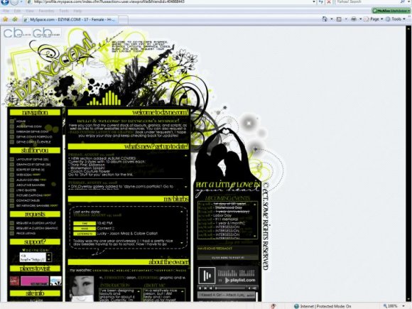
So after the myspace mishap..., I've ended up with this. |
Resource Center Links
This Month's Contests | Hosts Looking for Hostees | Hostees looking for Hosts | BigBookofResources
Submission Guidelines

 Nov 6 2008, 12:41 AM Nov 6 2008, 12:41 AM
Post
#1
|
|
 (:  Group: Official Designer Posts: 461 Joined: Jul 2005 Member No: 184,978  |
EDIT//Banner is up.
Too big maybe? :S How do you get it to be below the ad instead of above it? Well this is what I have so far: http://www.myspace.com/dzynedotcom Ever since myspace deleted my entire DIV layout :( FROM THIS TO THIS I'd have to say it's not bad for slapping it together in one night. Been so disappointed about losing the other one lately :( So I'm too lazy to recode my DIV... so I went back to the usual "DIV Influenced" Standard layout lol. Still thinking about adding a banner at the top, but not sure what to make it look like. Ideas? Also any other ideas/suggestions for what I should include/not include? |
|
|
|




 |
Replies
(1 - 24)
|
Nov 6 2008, 04:42 PM
Post
#2
|
|
 Senior Member Group: Staff Alumni Posts: 2,435 Joined: Feb 2007 Member No: 506,205 |
I love div-esque defaults.
 I think the picture of the girl with with the speech bubble looks a little tacky, but other than that it's very cute and clean. I think the picture of the girl with with the speech bubble looks a little tacky, but other than that it's very cute and clean.I would add the top banner, but make it really simple. Maybe something like your sig? |
|
|
|

|
Nov 6 2008, 07:09 PM
Post
#3
|
|
 Sex, Blood, & RocknRoll Group: People Staff Posts: 5,305 Joined: Nov 2007 Member No: 596,480 |
I like layouts like this, but is seems kind of misalined for me.
Fire Fox 1024x768 I agree that the girl looks a little cheesy though. |
|
|
|


|
Nov 6 2008, 07:15 PM
Post
#4
|
|
 Naomi loves you. Y'all may call me NaNa Group: Official Designer Posts: 2,925 Joined: Jun 2006 Member No: 427,774 |
Yeah it's looks misaligned in FF for me too. I'm using the latest version. I like it and it would look nice with a banner.
|
|
|
|

|
Nov 6 2008, 08:42 PM
Post
#5
|
|
|
(: Group: Official Designer Posts: 461 Joined: Jul 2005 Member No: 184,978 |
Lol that girl is me
 I just needed to put something there to fill space. My last layout had a picture of me and a little bio, that's what I was going to do, but I decided against it this time and just left the pic :P I need to replace it with something  ...most likely... a penguin. lol. ...most likely... a penguin. lol.If it is misaligned, it's because I have my background aligned center right because for some reason that's the only way it aligned in my resolution. It should be center center for it to align for most people, but then it wouldn't look right to me lol. So, any other banner ideas? A little animation maybe? Colors, fonts, etc? I kind of wanted to use a script font in the same lime green color, but I didn't know if it would look dumb because all my other headings are using georgia font. :S And I was going to include my penguin logo but I wasn't sure if I was already using it too much. Ideas? |
|
|
|
|
Nov 6 2008, 08:44 PM
Post
#6
|
|
|
Senior Member Group: Staff Alumni Posts: 2,435 Joined: Feb 2007 Member No: 506,205 |
QUOTE(schizo @ Nov 6 2008, 03:42 PM)  ...make it really simple. Maybe something like your sig?  |
|
|
|
|
Nov 6 2008, 10:05 PM
Post
#7
|
|
|
(: Group: Official Designer Posts: 461 Joined: Jul 2005 Member No: 184,978 |
^You don't think it would clash/be too much?
Guess I'll just make it later & find out :P |
|
|
|
|
Nov 6 2008, 11:22 PM
Post
#8
|
|
 Two can keep a secret if one of them is dead. Group: Staff Alumni Posts: 2,682 Joined: Jun 2005 Member No: 156,187 |
oi? netscape also has it looking messy.
I do agree the pic of you and the bubble is a little tacky. would look better with penguin you have as the logo instead.  
|
|
|
|

|
Nov 7 2008, 12:02 AM
Post
#9
|
|
|
(: Group: Official Designer Posts: 461 Joined: Jul 2005 Member No: 184,978 |
^For some reason I think it only looks fine in larger resolutions. :S iono.
So I changed my pic to a little doll that kinda looks like me with a penguin instead so it's a little less redundant with all the logos but still represents me. Better? |
|
|
|
|
Nov 7 2008, 12:19 AM
Post
#10
|
|
|
Senior Member Group: Member Posts: 71 Joined: Jul 2008 Member No: 671,706 |
it's misaligned in the exact same way for me. i'm running firefox 3, and my res is 1280x800. dunno if that helps. :c
but the elouai doll looks worse than the picture of yourself. the layout, overall, however, looks awesome. :D |
|
|
|

|
Nov 7 2008, 12:30 AM
Post
#11
|
|
|
(: Group: Official Designer Posts: 461 Joined: Jul 2005 Member No: 184,978 |
Why does it look worse?
Is it because it's red and nothing else is red? Or because it's anime-ish? lol. I am at a loss for what to put there. I want a picture there, but I don't want it to be my logo since it's already on my page so many times :S Also, my res is 1280x960 and it aligns for me. My other desktop is WAY bigger than that and it still aligns. It also aligns on my laptop. I'm not sure why it doesn't align for other people 
|
|
|
|
|
Nov 7 2008, 01:17 AM
Post
#12
|
|
|
Senior Member Group: Member Posts: 71 Joined: Jul 2008 Member No: 671,706 |
i think it's because it just looks like a different style than everything else. that, and the red thing. lol.
uhm. maybe draw up your face (with a thoughtful expression?) however you did your little penguin logo? i'm not sure. :3 |
|
|
|
|
Nov 7 2008, 01:25 AM
Post
#13
|
|
|
(: Group: Official Designer Posts: 461 Joined: Jul 2005 Member No: 184,978 |
^I was thinking of doing that. I wish I had a tablet
I guess it will just have to stay for now :P I wonder if the resolution problems are only in FF and not IE? I'm using IE and it's fine. FF users seem to have the alignment problems. &Netscape. |
|
|
|
|
Nov 7 2008, 01:48 AM
Post
#14
|
|
|
Senior Member Group: Member Posts: 71 Joined: Jul 2008 Member No: 671,706 |
oooh, that's probably it. there's some funky coding differences between firefox and ie. like, there's codes that only firefox understands, and there's codes that only internet explorer understands (i believe.)
like, in firefox, the scrollbar is the same color/size/shape. always. there's not really a code that can change that. et cetera. ya. |
|
|
|
|
Nov 7 2008, 01:56 AM
Post
#15
|
|
 ٩(͡๏̯͡๏)۶ Group: Staff Alumni Posts: 14,309 Joined: Nov 2004 Member No: 65,593 |
you're mad cute.
|
|
|
|

|
Nov 7 2008, 01:58 AM
Post
#16
|
|
|
(: Group: Official Designer Posts: 461 Joined: Jul 2005 Member No: 184,978 |
That's like the 3rd time LOL :P
|
|
|
|
|
Nov 7 2008, 07:39 AM
Post
#17
|
|
|
Two can keep a secret if one of them is dead. Group: Staff Alumni Posts: 2,682 Joined: Jun 2005 Member No: 156,187 |
QUOTE(ect @ Nov 7 2008, 12:02 AM) ^For some reason I think it only looks fine in larger resolutions. :S iono. So I changed my pic to a little doll that kinda looks like me with a penguin instead so it's a little less redundant with all the logos but still represents me. Better? the banner looks great, same with the pixel chick. as for the links, have you tried adding <br> or display:block; to them? for some odd reason they bunch up. I have no clue what gives off the black border nor why its as wide as it is.  QUOTE(ect @ Nov 7 2008, 01:25 AM) ^I was thinking of doing that. I wish I had a tablet I guess it will just have to stay for now :P I wonder if the resolution problems are only in FF and not IE? I'm using IE and it's fine. FF users seem to have the alignment problems. &Netscape. lol i'm looking into getting a tablet. Dell has a few good ones for a good price. netscape is a mix of safari and firefox. |
|
|
|
|
Nov 7 2008, 01:13 PM
Post
#18
|
|
|
٩(͡๏̯͡๏)۶ Group: Staff Alumni Posts: 14,309 Joined: Nov 2004 Member No: 65,593 |
QUOTE(ect @ Nov 6 2008, 10:58 PM) That's like the 3rd time LOL :P Third time what? |
|
|
|
|
Nov 7 2008, 01:14 PM
Post
#19
|
|
|
(: Group: Official Designer Posts: 461 Joined: Jul 2005 Member No: 184,978 |
^Thanks(:
About the links, I'll try adding a <br> after them. I thought they were on display:block, but I might be wrong. The links are also only like that in FF. In IE it lines up. :/ |
|
|
|
|
Nov 7 2008, 01:44 PM
Post
#20
|
|
|
٩(͡๏̯͡๏)۶ Group: Staff Alumni Posts: 14,309 Joined: Nov 2004 Member No: 65,593 |
better answer my question.

|
|
|
|
|
Nov 7 2008, 01:46 PM
Post
#21
|
|
|
(: Group: Official Designer Posts: 461 Joined: Jul 2005 Member No: 184,978 |
^Third time you said that lol.
What's with the hostile smiley ?!  |
|
|
|
|
Nov 7 2008, 01:55 PM
Post
#22
|
|
|
٩(͡๏̯͡๏)۶ Group: Staff Alumni Posts: 14,309 Joined: Nov 2004 Member No: 65,593 |
But you are mad cute!
 Hostile smiley is for you ignoring my question the first time around! 
|
|
|
|
|
Nov 7 2008, 02:02 PM
Post
#23
|
|
|
(: Group: Official Designer Posts: 461 Joined: Jul 2005 Member No: 184,978 |
^
 sorry sorry! :S sorry sorry! :SAnyways, any more feedback about the banner? It's my biggest concern atm. I kind of feel it's too big, but I don't know if I should make it smaller or if it matches or not. Ideas? |
|
|
|
|
Nov 7 2008, 07:14 PM
Post
#24
|
|
|
Two can keep a secret if one of them is dead. Group: Staff Alumni Posts: 2,682 Joined: Jun 2005 Member No: 156,187 |
CODE a.linkies:link, a.linkies:active, a.linkies:visited{ background-image:url("http://i34.tinypic.com/1iy8gh.gif"); background-repeat: no-repeat; background-position: right; background-color:ffffff; color:000000; font-family:century gothic; font-size:9px; text-align:right; padding-right:20px; line-height:12px; text-decoration:none; width:270px; text-transform:uppercase; font-weight:normal; letter-spacing:0pt; margin-bottom:2px; } a.linkies:hover{ background-image:url("http://i33.tinypic.com/r1zrqc.gif"); background-repeat: no-repeat; background-position: right; background-color:ffffff; color:000000; font-family:century gothic; font-size:9px; padding-right:20px; line-height:12px; text-align:right; padding-left:20px; text-decoration:none; width:270px; text-transform:uppercase; font-weight:normal; letter-spacing:2pt; margin-bottom:2px; } try adding display:block; to those links. also adding !important; to each line makes sure that the same effect shows up on all browsers. http://www.createblog.com/scripts/script.php?id=1137 ^ under the nav |
|
|
|
|
Nov 7 2008, 07:36 PM
Post
#25
|
|
 sang loves hayden. Group: Staff Alumni Posts: 3,373 Joined: Feb 2004 Member No: 5,687 |
I really like this. Nice appeal as a whole. I like the colors too.
|
|
|
|


 |
1 User(s) are reading this topic (1 Guests and 0 Anonymous Users)
0 Members: