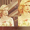
my first graphic =) |
Resource Center Links
This Month's Contests | Hosts Looking for Hostees | Hostees looking for Hosts | BigBookofResources
Submission Guidelines

 Sep 15 2008, 09:54 PM
Post
#1
|
|
|
Member  Group: Member Posts: 24 Joined: Sep 2008 Member No: 685,089  |
hiiii ppls
well On photoshop i was just messing around and i came up with my first real graphic!  i was gonna make a div with it but i said 2 my self its not good enough |
|
|
|


 |
Replies
(1 - 10)
|
Sep 15 2008, 10:08 PM
Post
#2
|
|
 ;) Group: Duplicate Posts: 2,374 Joined: Feb 2004 Member No: 3,760 |
Moved to Showcase
:D I think it's nice. It's just lacking... a coherent theme. The random brushes/stamps doesn't really go with the overall look. It seems like you're using a bunch of ideas and slapping them together. It's really good for your first graphic, though! |
|
|
|

|
Sep 15 2008, 10:12 PM
Post
#3
|
|
|
Member Group: Member Posts: 24 Joined: Sep 2008 Member No: 685,089 |
QUOTE(----- @ Sep 15 2008, 10:08 PM)  Moved to Showcase :D I think it's nice. It's just lacking... a coherent theme. The random brushes/stamps doesn't really go with the overall look. It seems like you're using a bunch of ideas and slapping them together. It's really good for your first graphic, though! moved to showcase? what does all that moved blank blank means? and thankuu!! weoz when imma get betterr soon.someday |
|
|
|
|
Sep 15 2008, 11:24 PM
Post
#4
|
|
 Senior Member Group: Administrator Posts: 8,629 Joined: Jan 2007 Member No: 498,468 |
Yeah, I agree with Melissa.
"Moved to ___________" means she moved the topic to the proper location. You didn't have it in the correct place when you made the topic. 
|
|
|
|


|
Sep 16 2008, 12:00 AM
Post
#5
|
|
 Senior Member Group: Member Posts: 179 Joined: Sep 2008 Member No: 683,638 |
I think it looks great. You should make it into a layout.
|
|
|
|

|
Sep 16 2008, 12:35 AM
Post
#6
|
|
 <3 Group: Member Posts: 38 Joined: May 2007 Member No: 524,805 |
Nice, I like it.

|
|
|
|

|
Sep 16 2008, 05:48 AM
Post
#7
|
|
 Jooleeah <3 Group: Official Designer Posts: 687 Joined: Jun 2008 Member No: 662,481 |
It lacks a theme but it's way better than my first ps attempt! Good going.
|
|
|
|

|
Sep 16 2008, 10:56 AM
Post
#8
|
|
|
Member Group: Member Posts: 24 Joined: Sep 2008 Member No: 685,089 |
thanks.
lacks a theme? what do you mean? 
|
|
|
|
|
Sep 16 2008, 12:26 PM
Post
#9
|
|
 yo yo yiggidy yo. Group: Official Member Posts: 1,606 Joined: Mar 2005 Member No: 108,591 |
this looks great! especially for your first graphic, great job.
 and they're talking about what you're trying to show us. like, make everything fit together. for example, natalia's [manny-the-dino] signature's theme is james franco and everything she used fits together. |
|
|
|

|
Sep 16 2008, 12:32 PM
Post
#10
|
|
|
Member Group: Member Posts: 24 Joined: Sep 2008 Member No: 685,089 |
ohk! i see.hmm weoz im not gonna edit this graphic no more
but what would you say i could of put in? |
|
|
|
|
Sep 16 2008, 03:53 PM
Post
#11
|
|
 Senior Member Group: Staff Alumni Posts: 2,435 Joined: Feb 2007 Member No: 506,205 |
^Well, I don't really think you should have added anything to fix the theme problem that others mentioned. The brushes you chose are just a bit random. It looks really good for a first graphic, but what they're trying to say is stick with one kind of brush for your next one (ex: circle brushes, floral brushes, splat brushes, etc.).
|
|
|
|

 |
1 User(s) are reading this topic (1 Guests and 0 Anonymous Users)
0 Members: